I am a Graphic Designer with a 3.9 GPA and a foundational background in Business Administration. I’ve always been a researcher at heart, driven by the belief that useless facts are only useless until the moment they are used.
Whether I’m deep-diving into the history of an idiom, the evolution of a brand logo, or a three-hour documentaries, I’m looking for the story beneath the surface. This drive to understand "how it’s made" allows me to build more than just visuals, I help build brand architectures and product ecosystems that actually make sense for businesses.
With experience in retail leadership and production support, I bridge the gap between curiosity and practical results, from the technical math of a packaging dieline to 3D development.
I’m a motivated problem-solver dedicated to purposeful, high-fidelity design that helps brands truly connect with their audience.
I’m a motivated problem-solver dedicated to purposeful, high-fidelity design that helps brands truly connect with their audience.
SCROLL DOWN FOR SCHOOL PROJECTS
and see how I turn that research into results, from brand-building with
Reporter Dan to the technical evolution of Morton Salt
and see how I turn that research into results, from brand-building with
Reporter Dan to the technical evolution of Morton Salt

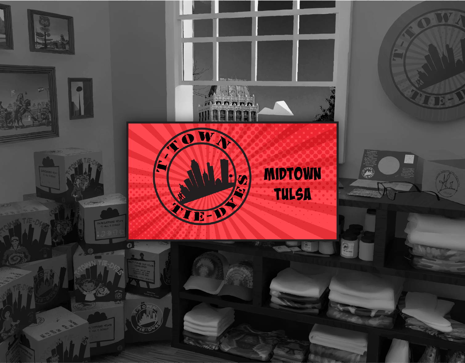
Volunteer Work
Fundraising event for local food banks
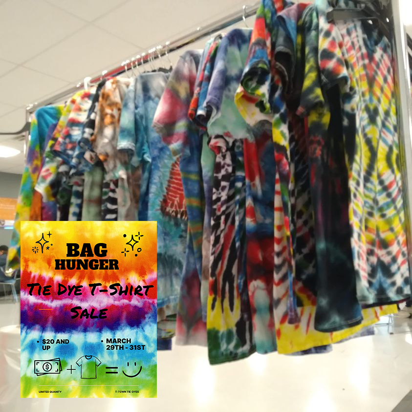
As mentioned on the T-Town Tie-Dyes page, I had the privilege to help raise money for our local food center. Through matched sales and pre-orders, we provided over 1K meals to local food banks.
Along with that, I joined a Colleague Resource Group formed to keep up morale in the building. I am proud to say that, in addition to putting together monthly bulletin boards,
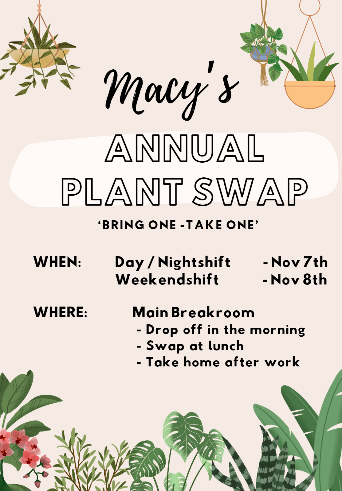
I started an Annual Plant Swap that continued for a couple of years after my departure
I started an Annual Plant Swap that continued for a couple of years after my departure
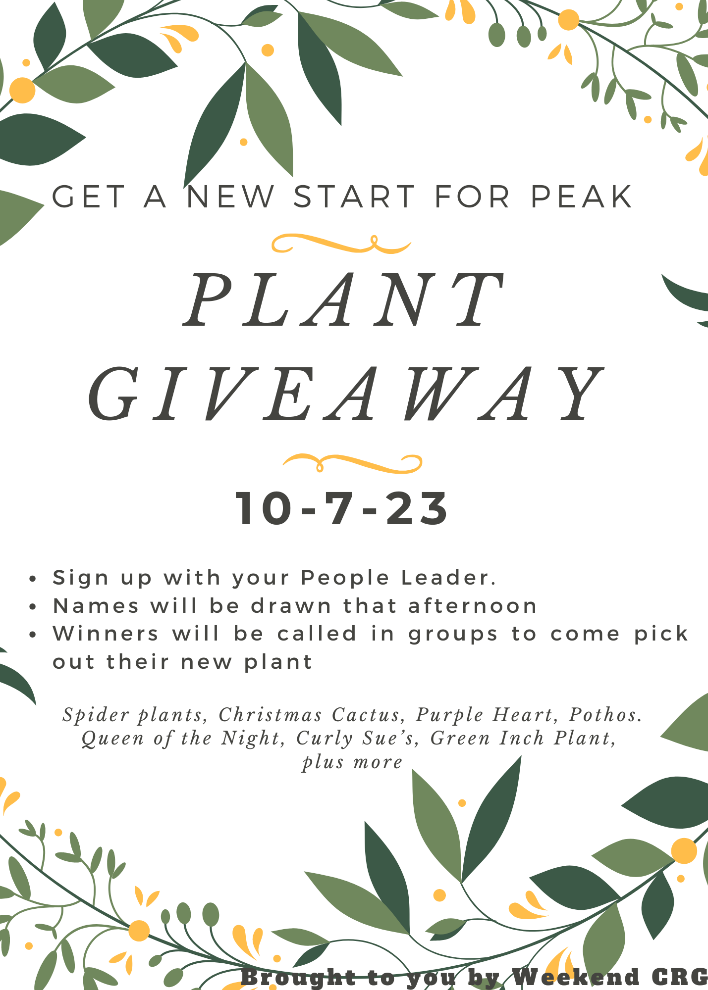
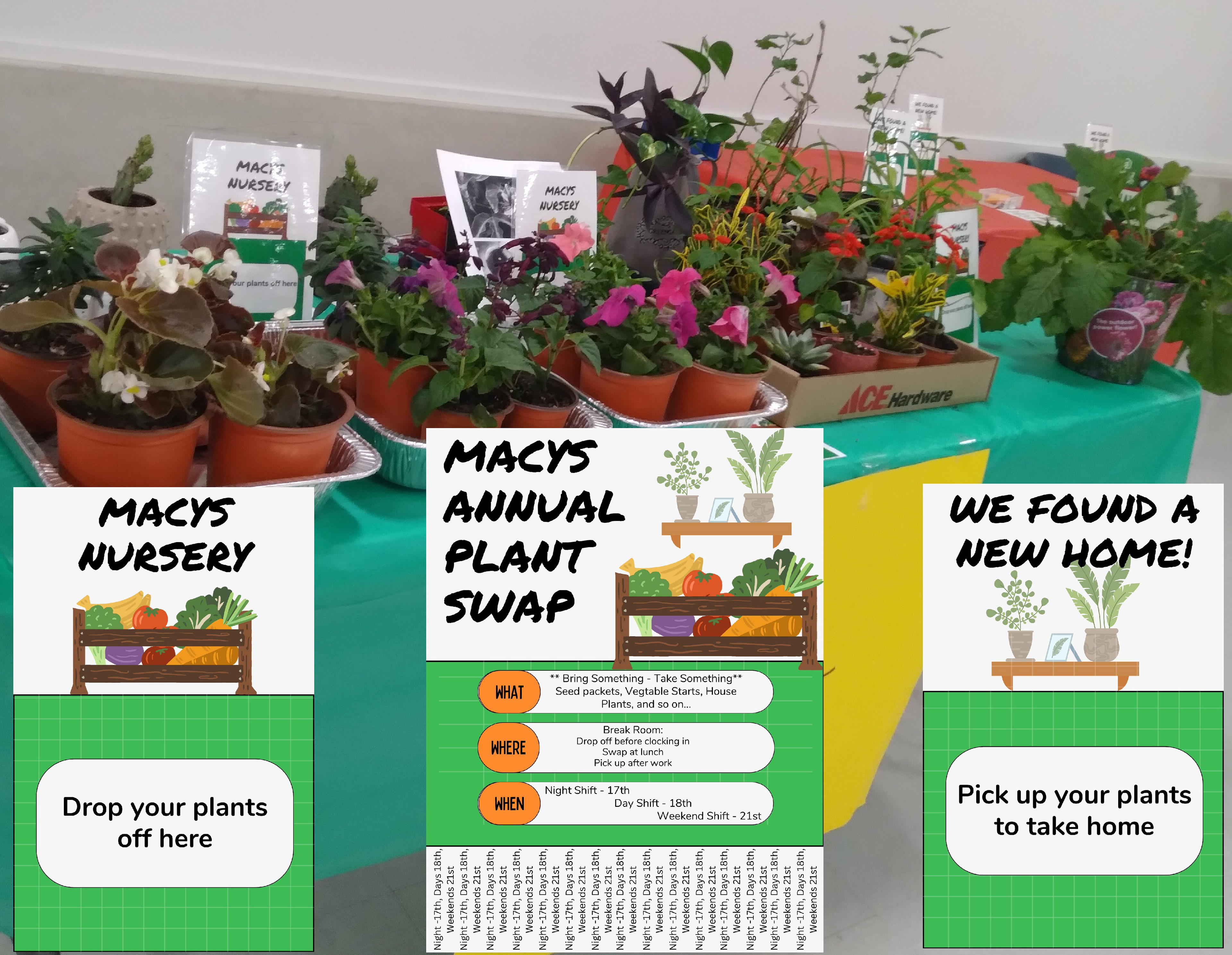
Plant Swap: designed and organized by yours truly

Booster Club Parent
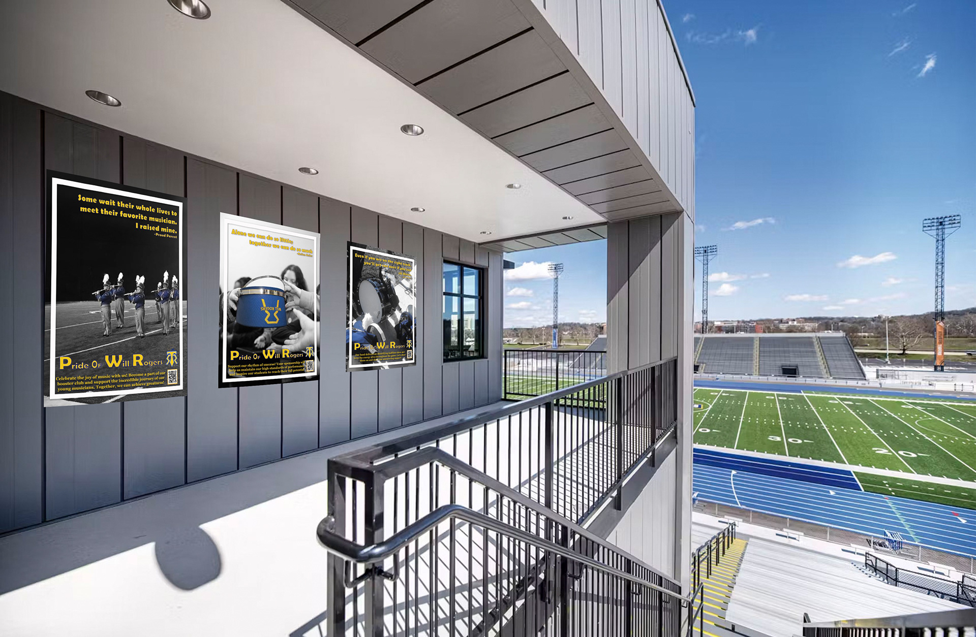
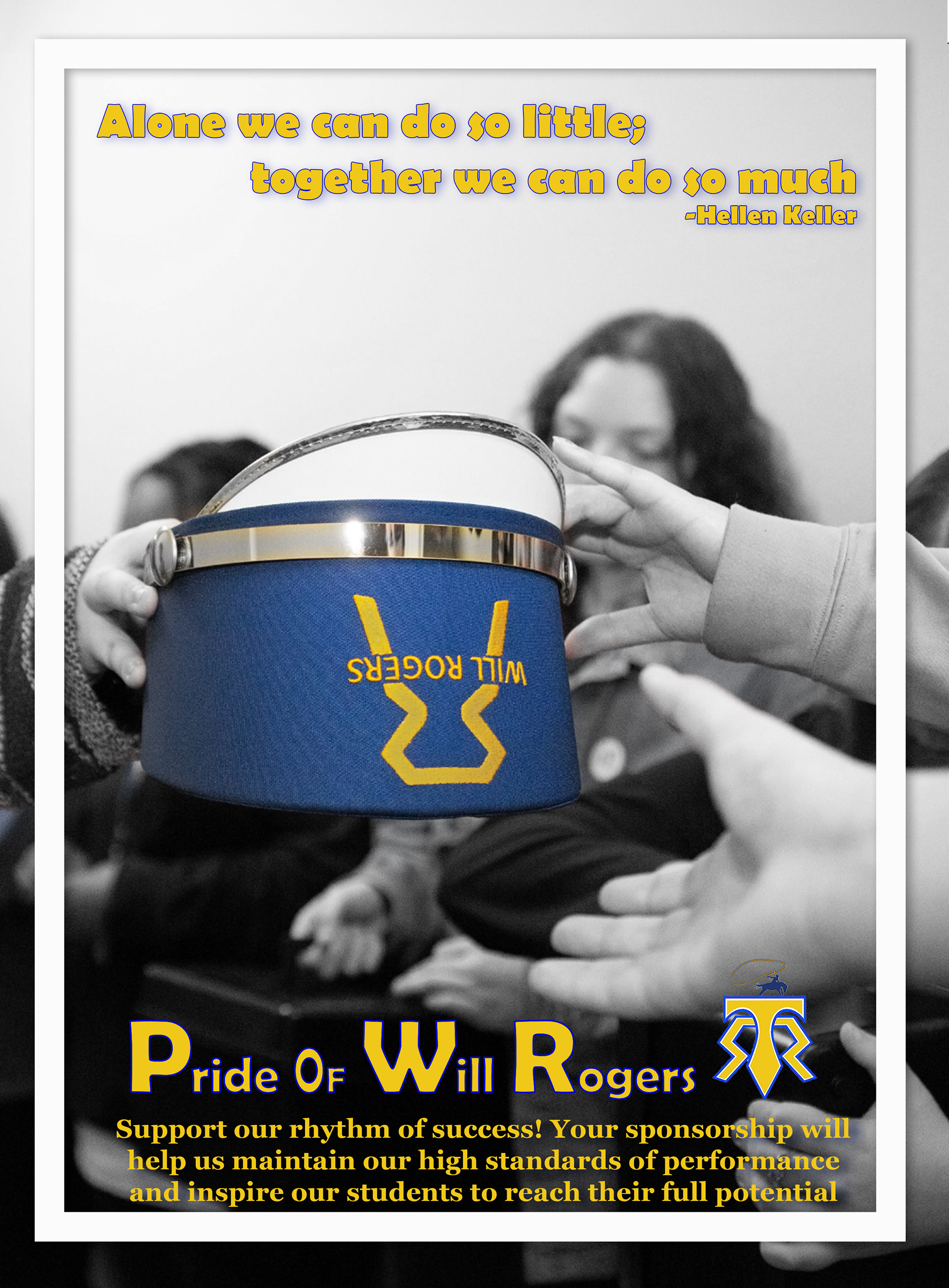
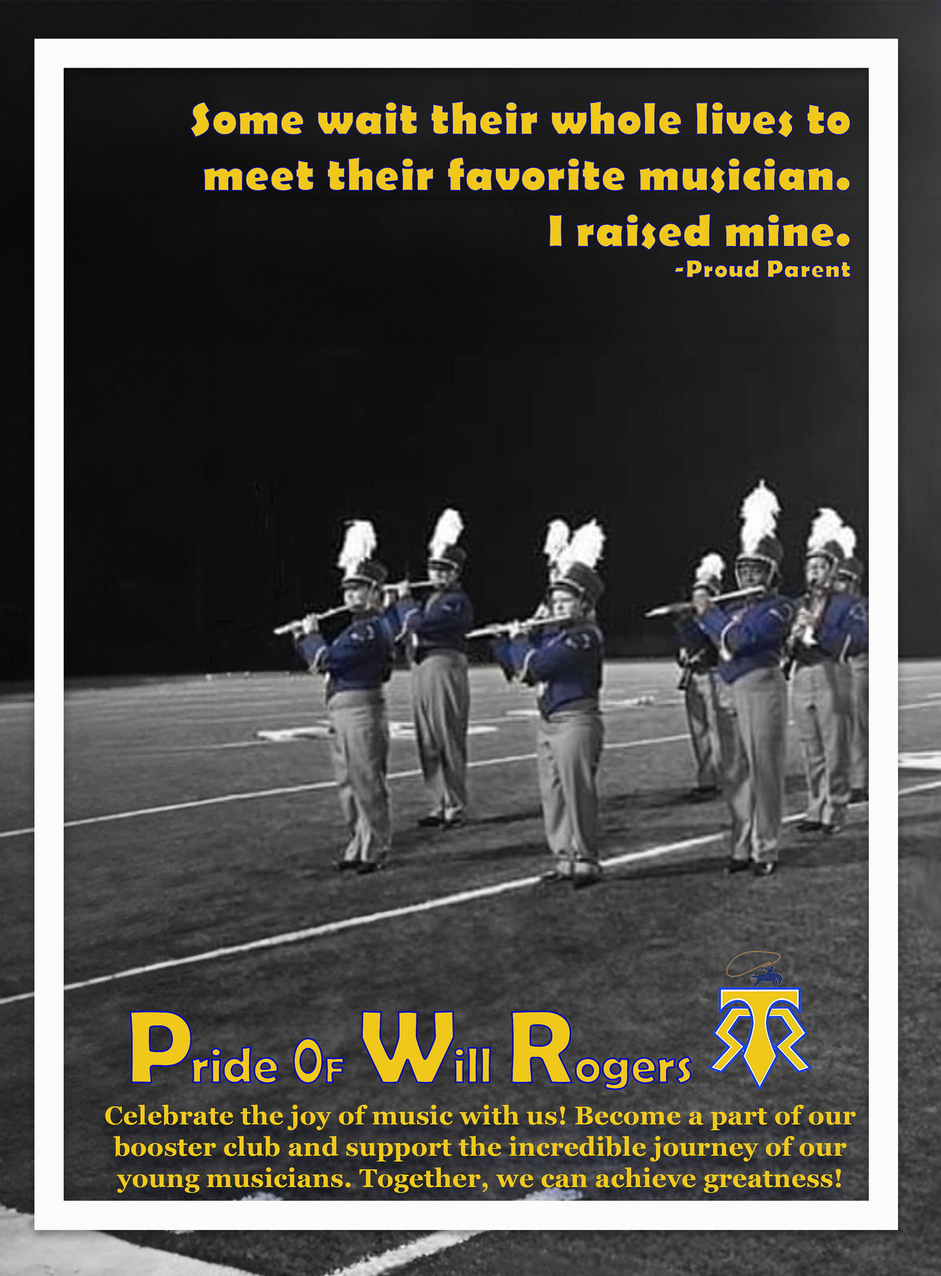
Marching Band Advertisements - Mockup
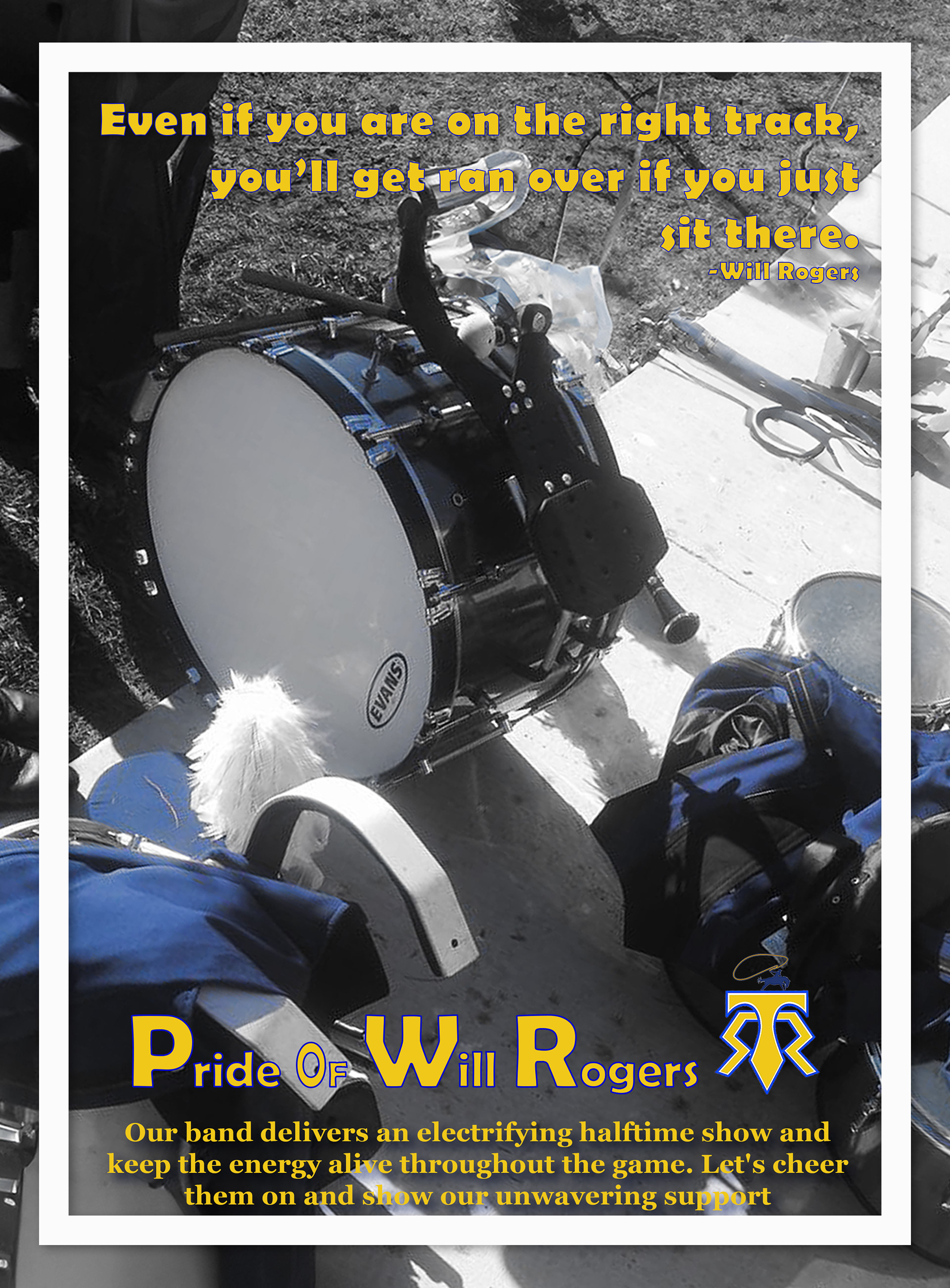
Another proud point in my life is being a band parent. After a decade in choir, I cannot image playing an instrument and wanted to use this opportunity as the subject in my CONCEPT DEVELOPMENT class.
I am currently in conversation on sending out the these examples as direct mail and fundraising flyers targeting students, parents, and sponsors.
Triple poster: targeting students to join band
Triple poster: targeting parents to join the booster club
Triple poster: targeting supporters to sponsor

ADVANCED VECTOR CLASS

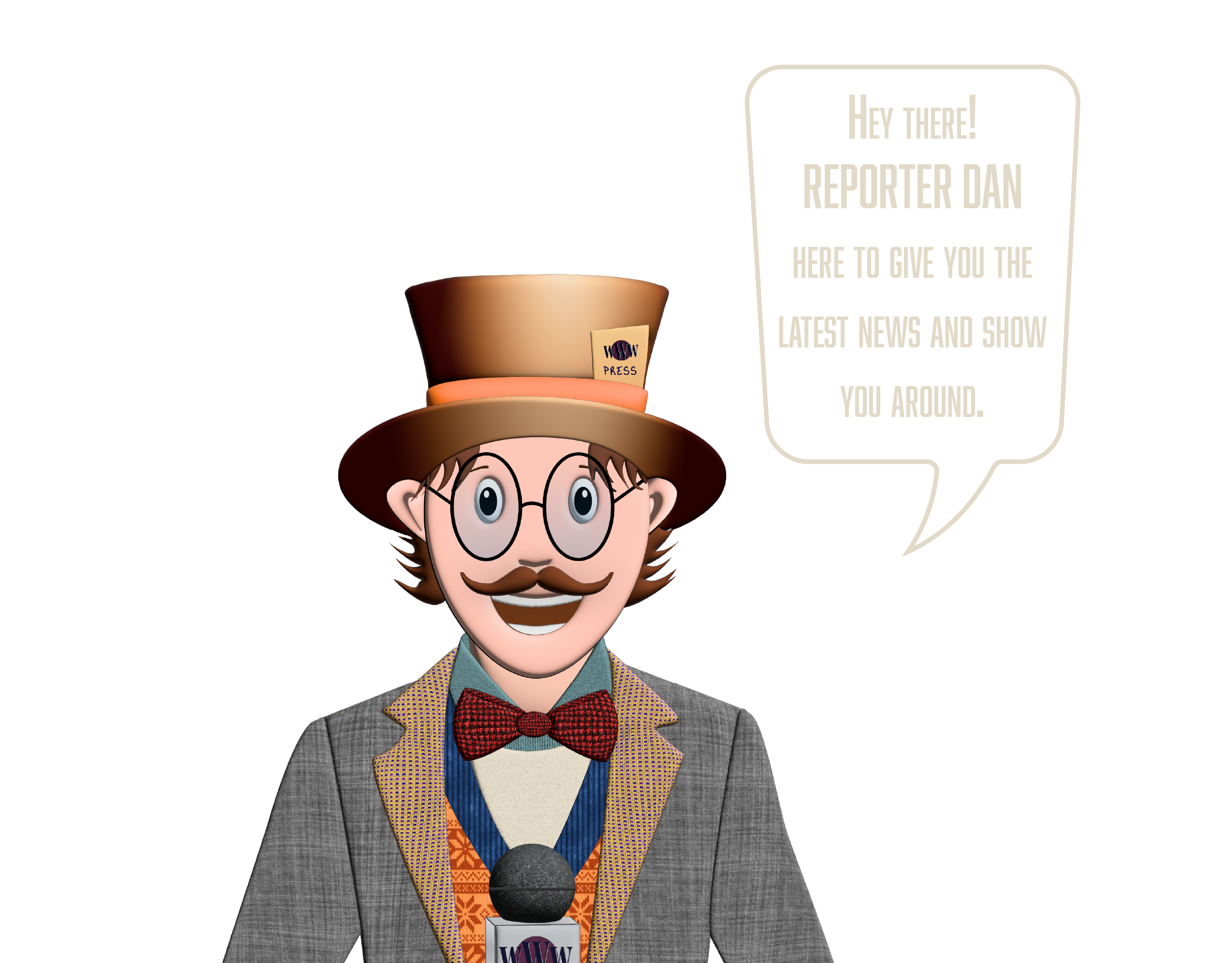
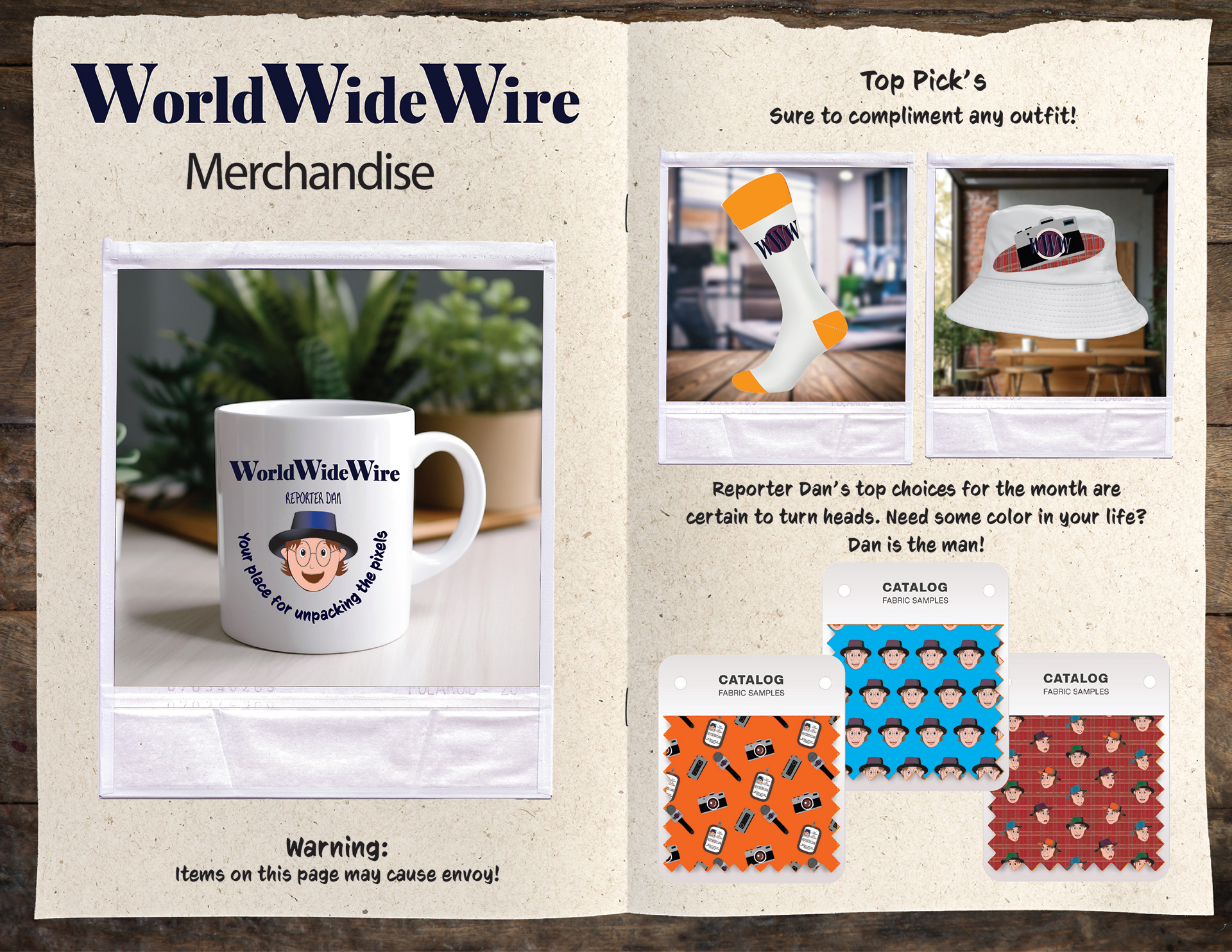
As I am sure you have met already, here is Reporter Dan. He is a bit of my personal mascot, and I thought I would share him with the website.
His personality is a bit of the Mad Hatter meets Clark Kent. His clothing and style are inspired by the sweater vests on The Big Bang Theory, and as I'm sure you could guess, he was named around the time I was watching a three-hour documentary on Forrest Gump for Aesthetics in Film.
Bringing him to life through his character sheet was a high point in my schooling.
Let me know if you'd like to see more of him, or the PowerPoint for Forrest Gump.


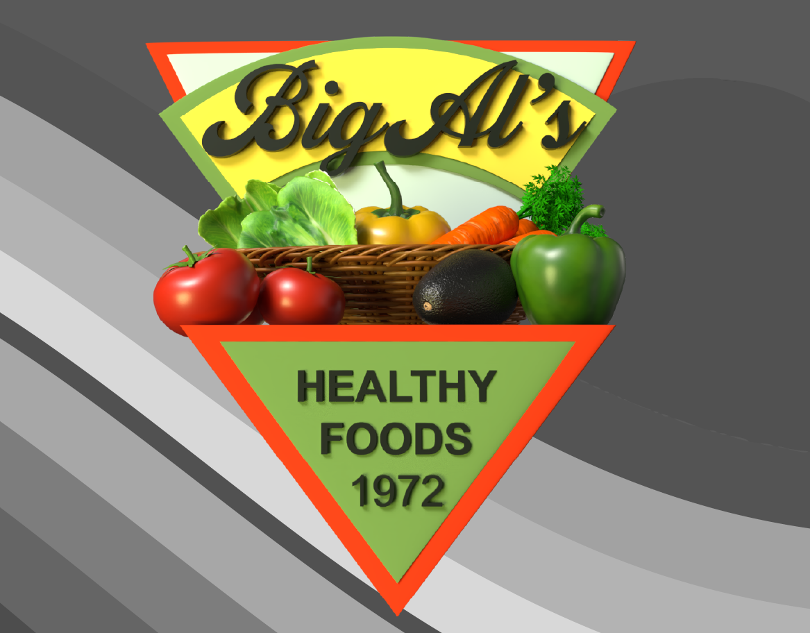
DESIGN FOR MARKETING
Fun Fact: This class was a solidifying moment where I knew I was in the right profession. I finally put a name to why my kitchen is covered in logos like Coca-Cola to Scooby-Doo.
I realized I had been a "case study" in successful consumer psychology. I felt a connection to these brands through their design and culture, and discovered I’d subconsciously been drawn to logos and graphics this whole time.
I chose to do a Morton Salt Powerpoint for several reasons, including the history of taxes (which explains my married name) and how salt companies evolved as electricity was modernized.
Let me know and I can share this with you.
Let me know and I can share this with you.
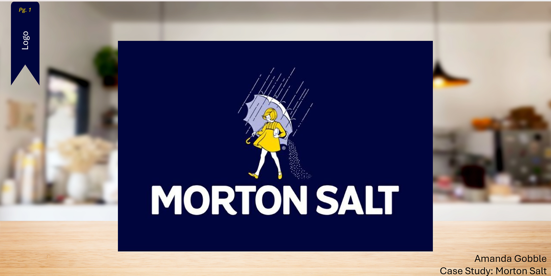
Powerpoint Slideshow For Morton Salt Marketing
Morton - Design Slide 3/25
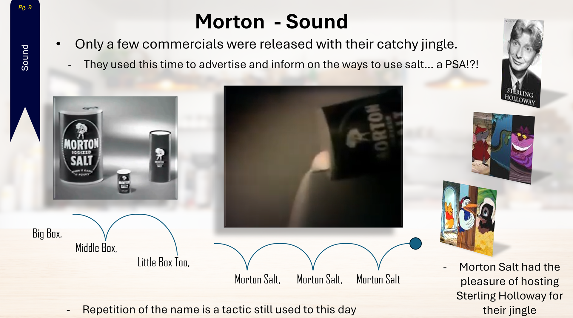
Morton - Sound Slide 9/25
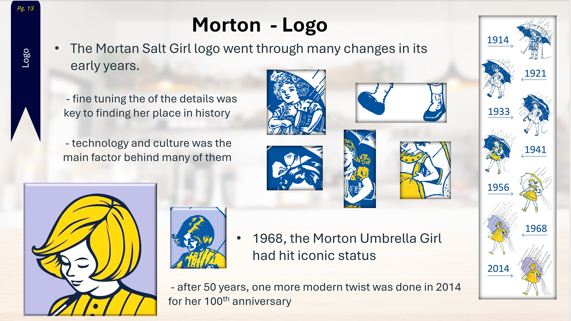
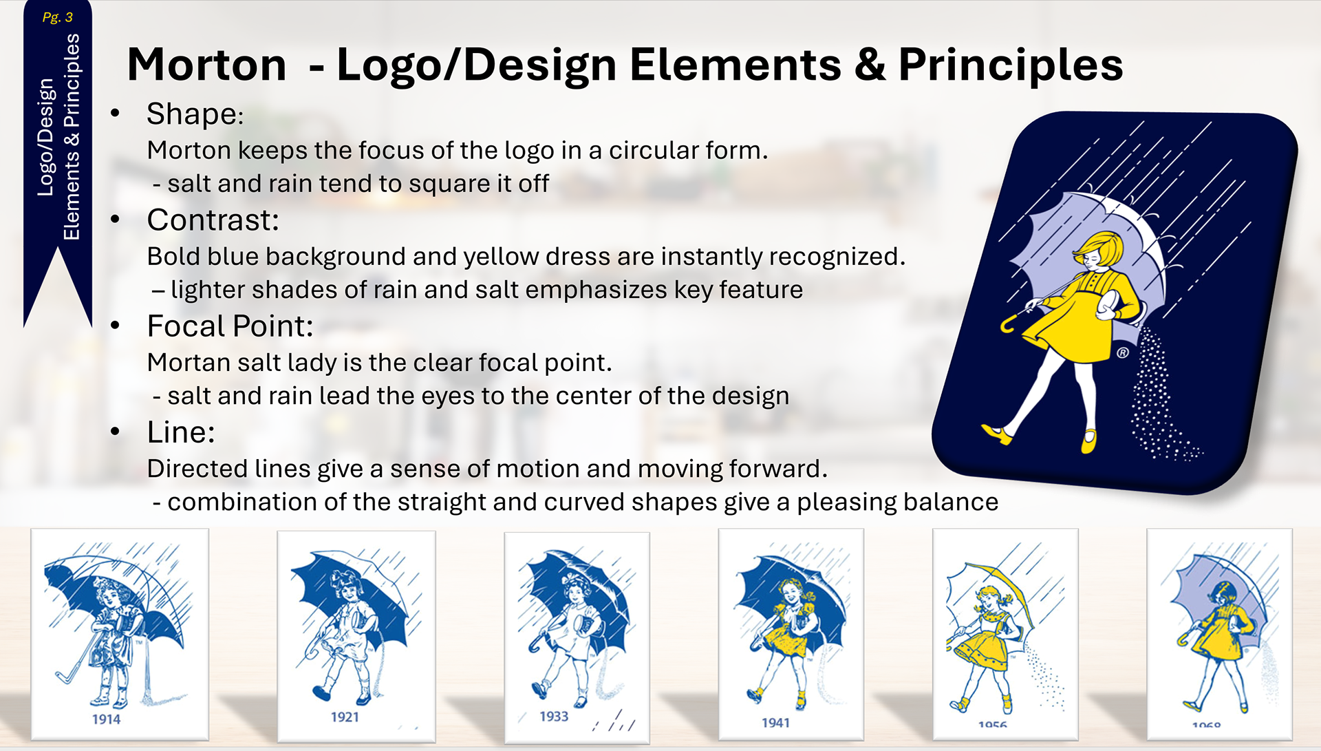
Morton - Logo Slide 13/25
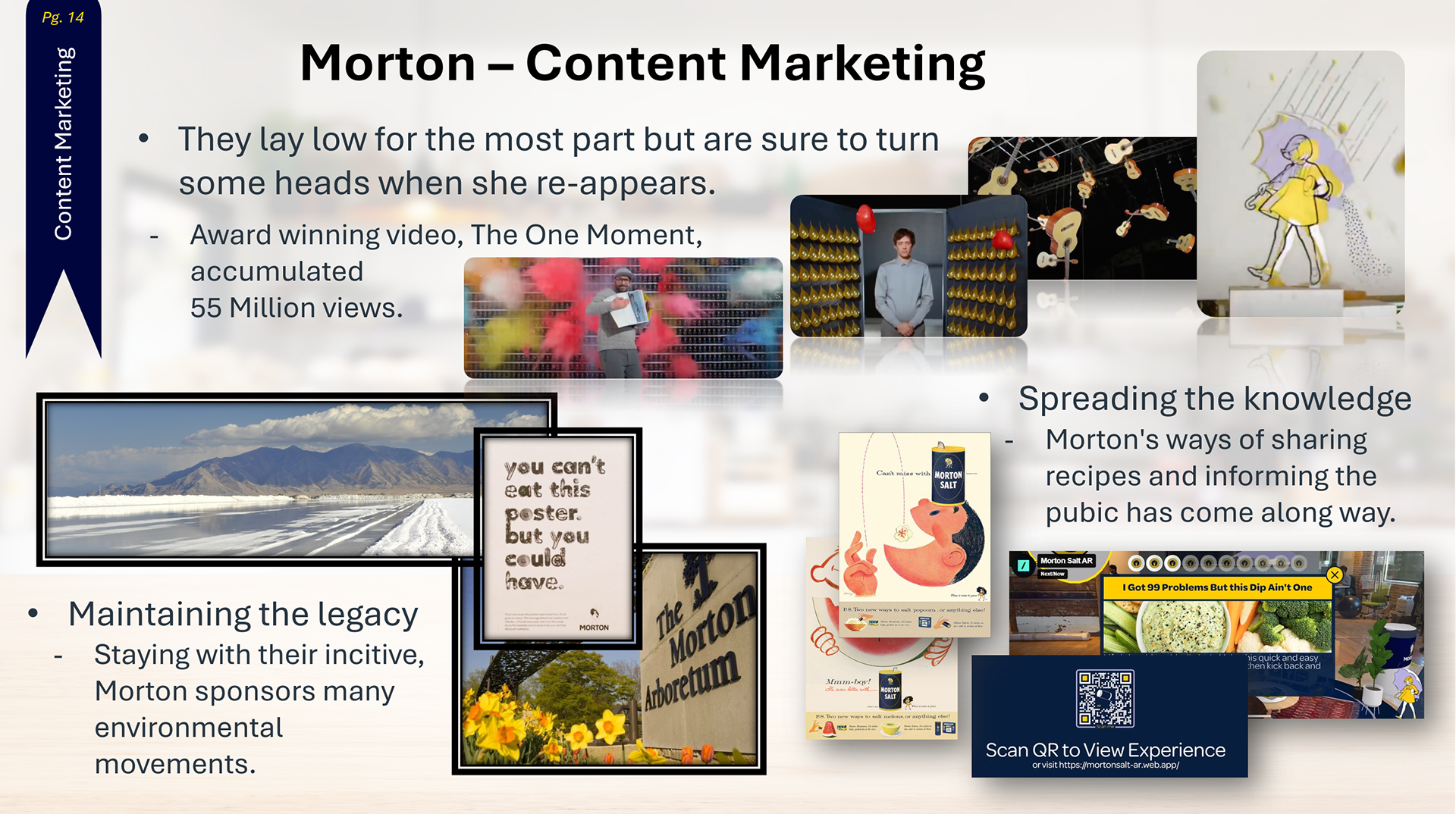
Morton - Logo Slide 14/25
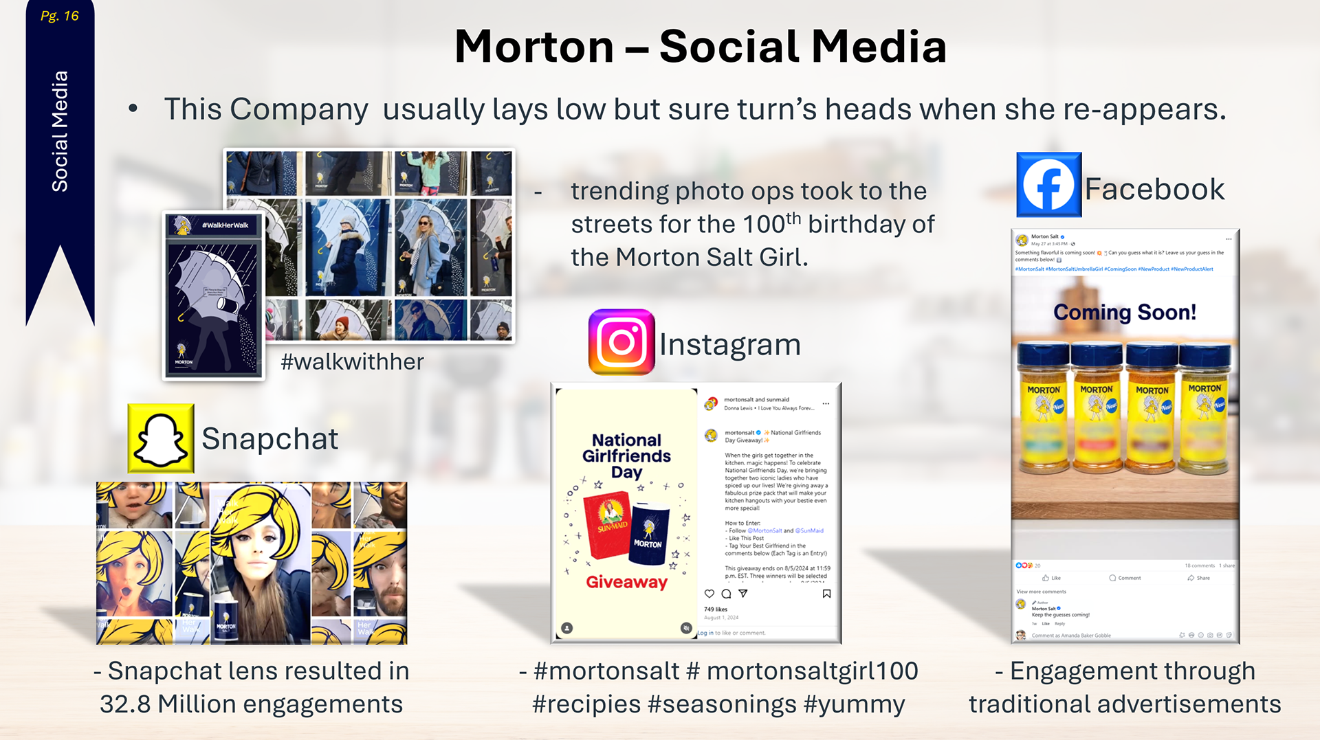
Morton - Social Media Slide 16/25
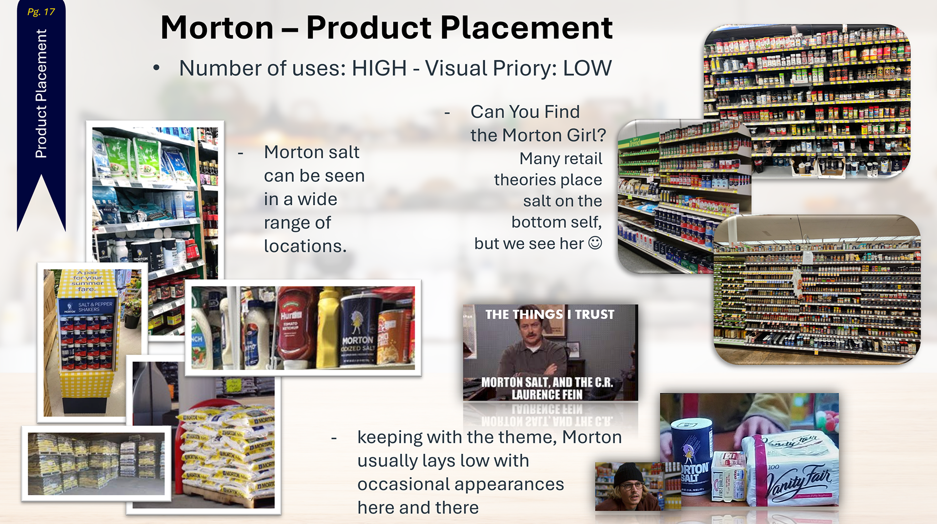
Morton - Product Placment Slide 17/25
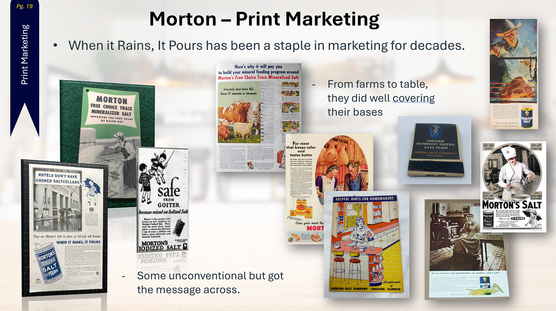
Morton - Print Media Slide 19/25
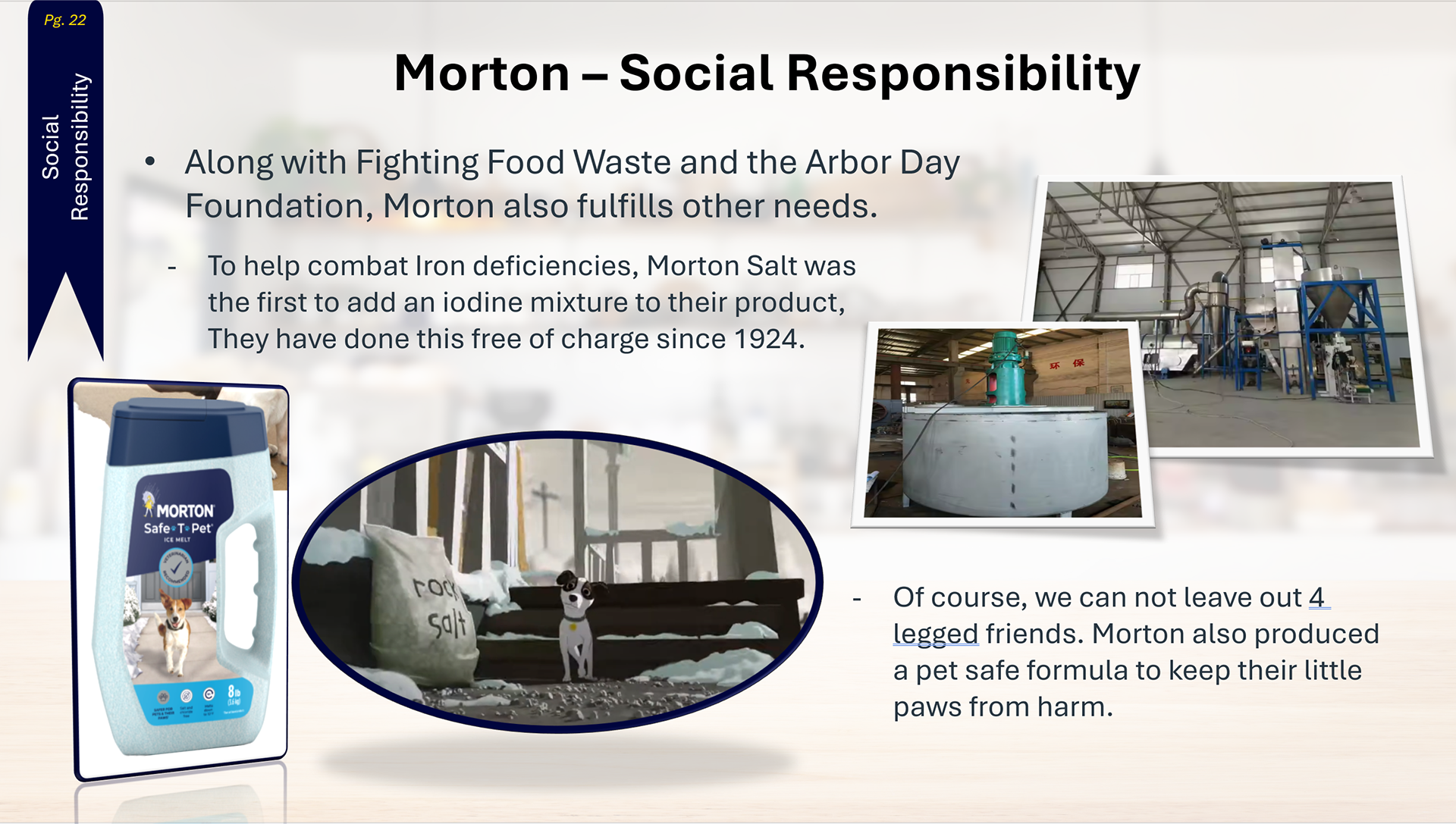
Morton - Social Media Slide 22/25

USER-CENTERED DESIGN
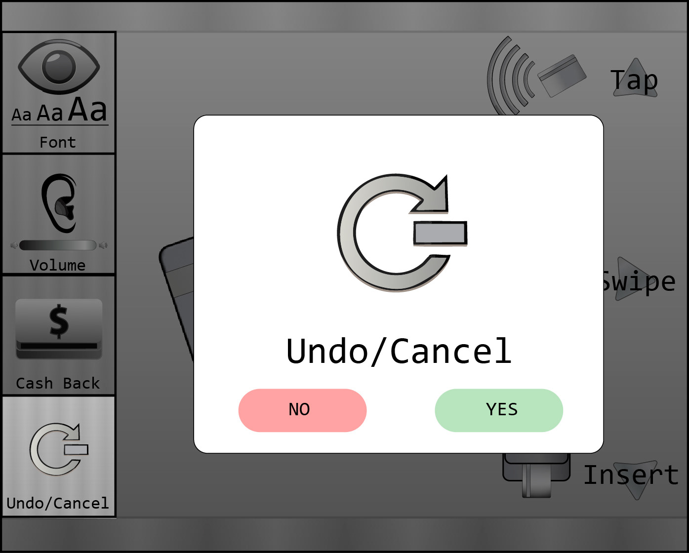
Given the challenge of finding an app or service to improve, I chose to make common card readers more user-friendly.
I started by researching touchpoints and conducting interviews, which led to a PowerPoint deck that not only
earned an A but became a featured
Student Example in the teacher's resource index.
earned an A but became a featured
Student Example in the teacher's resource index.
My research focused on accessibility, accommodating disabilities, reducing confusion, and increasing the speed of the interaction.
In my presentations, I like to use a clean visual style, muting the background to bring the main subject into focus.
If you’d like to see the full deck and my process, I would be glad to share this POWERPOINT also.
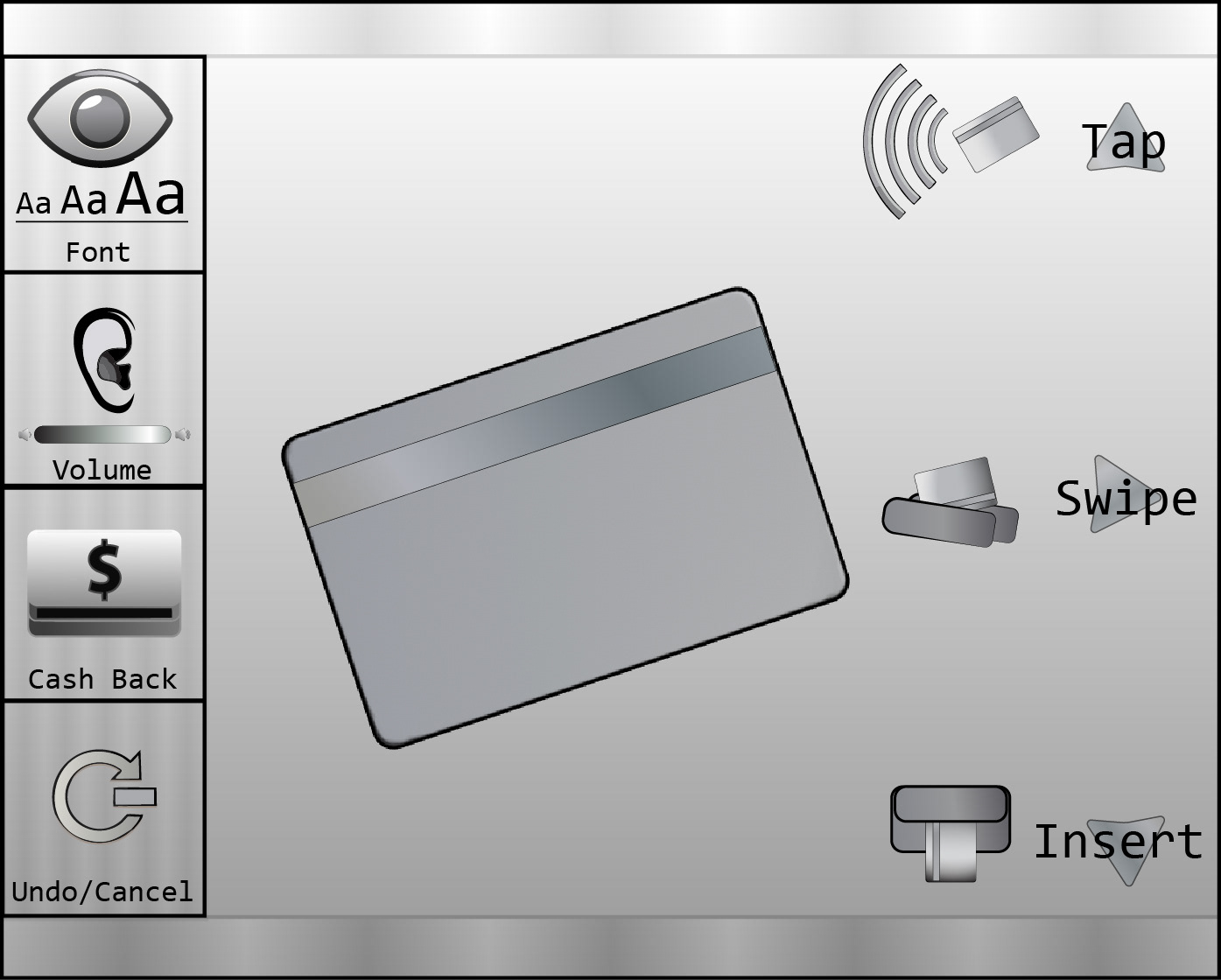
Opening Screen
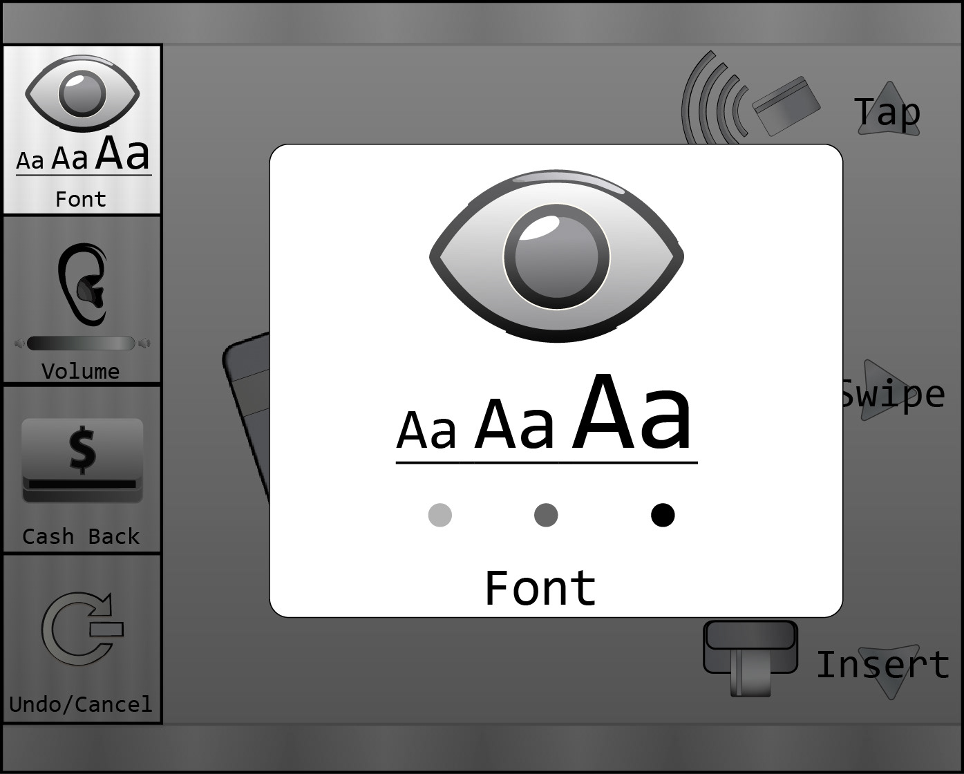
Visual Touchpoint
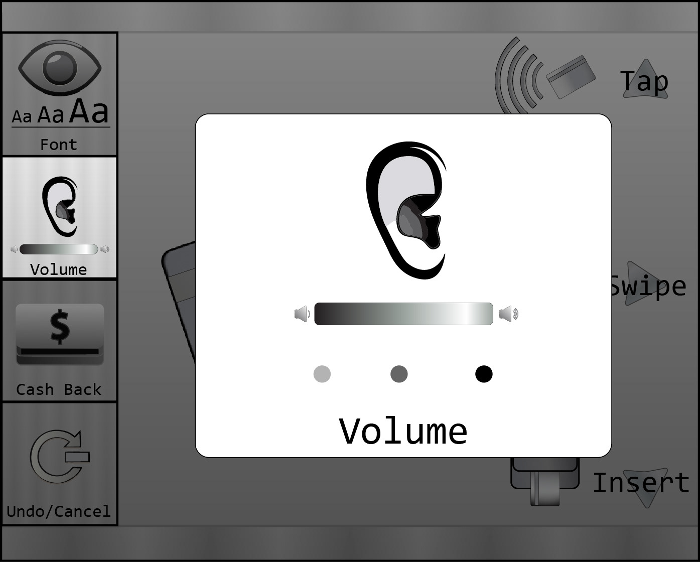
Hearing Touchpoint
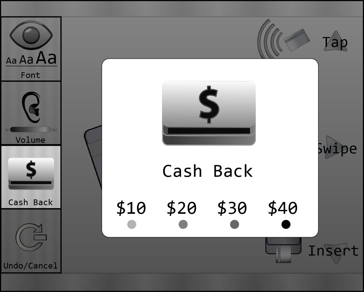
Cashback Touchpoint
Exit Touchpoint
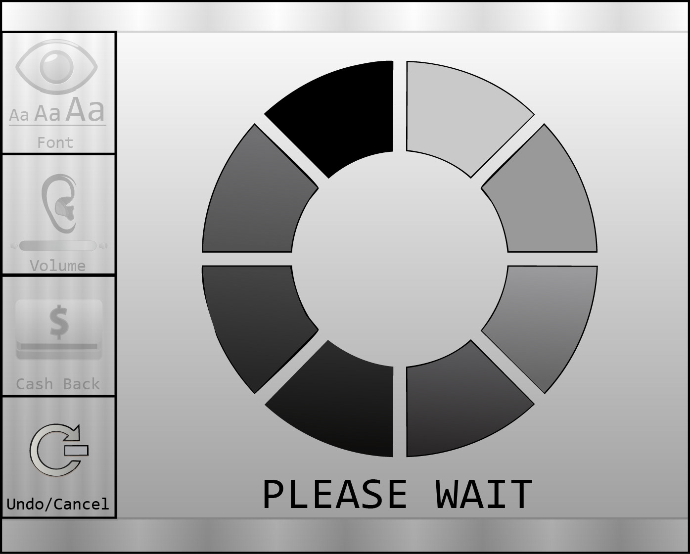
Processing Touchpoint

Confirmation Screen

Caution Screen

TYPOGRAPHY
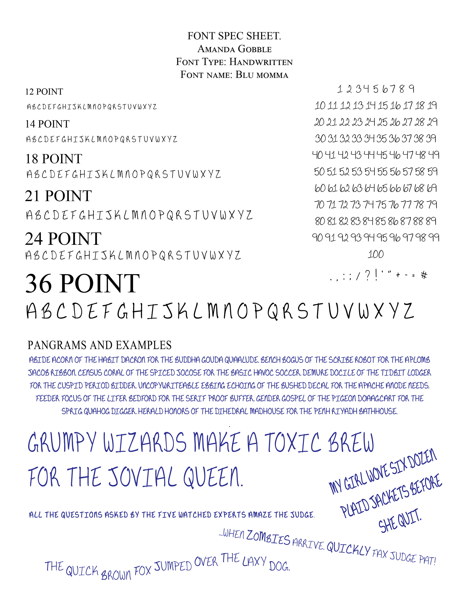
One more proud moment in my schooling was creating my own handwritten font. You can actually see it in several of my projects.
BLU MOMMA: This custom typeface is a tribute to my mother’s handwriting, (which I have always admired and seen in my own writing). The name also reflects my personal preference for using blue ink for contrast when writing on printed paper.
I also enjoyed other projects where I could push typography further, such as the Word Art piece. I used keywords to form a hand holding a key, representing how those values are the tools used to unlock a new way to live.
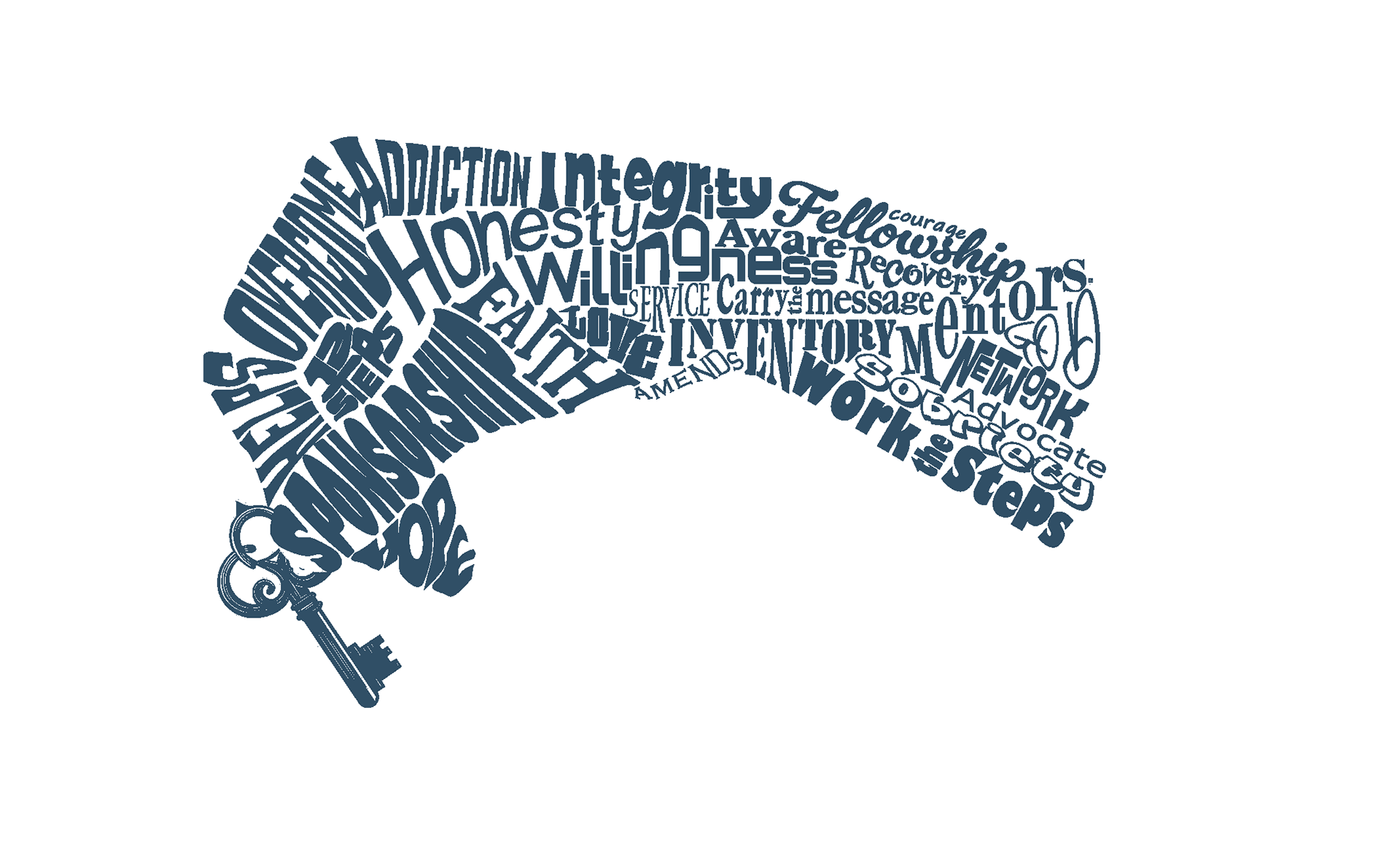
Custom Word Art done for a local meeting