GUMMY BARES
- INTERNSHIP -
I originally joined the team to help with social media, but it didn’t take long to see how much potential the brand had.
Working closely with the owner, I expanded my role into refreshing the logo, strengthening the visual identity, and building a cohesive product line that felt fun, bold, and ready for the shelf.
Together, we shaped a brand that stands out — balancing playful typography, high‑contrast colors, and a look that feels just as good online as it does in person.


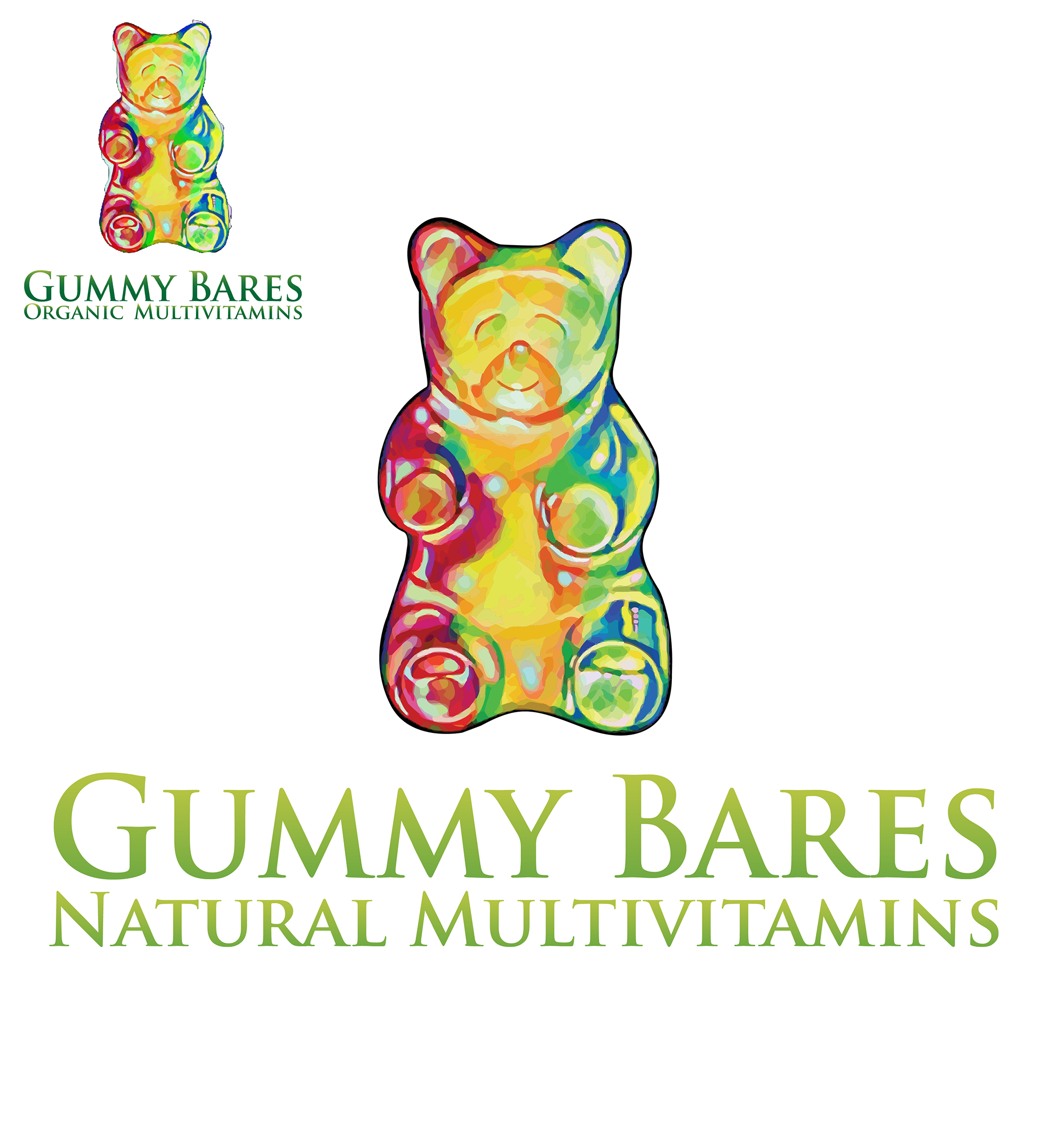
LOGO & package
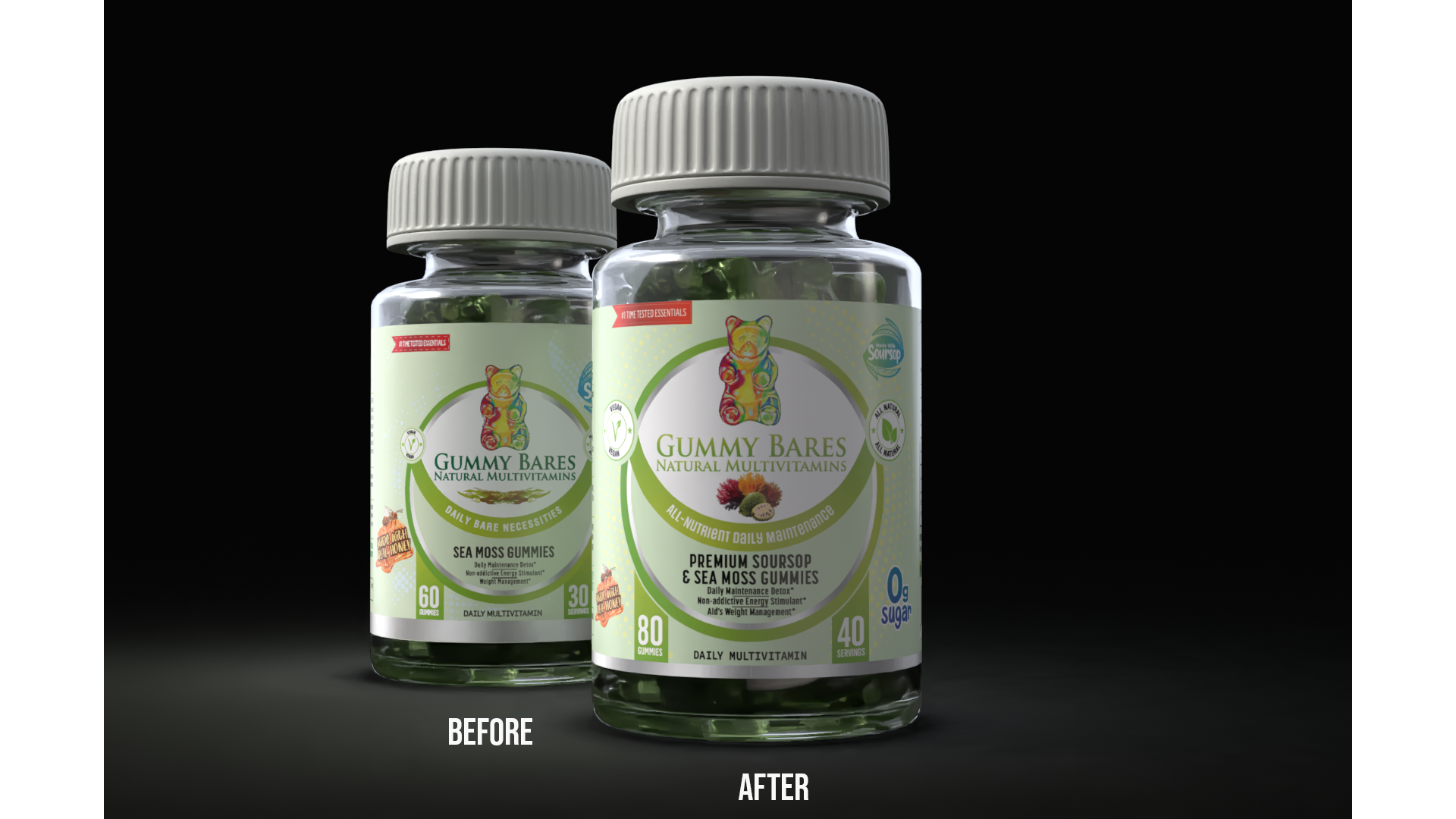
Collaborating with the owner, I refined the original Gummy Bares logo
and label to meet stronger design standards,
optimizing it for both digital and physical applications.
By sharpening the linework and adjusting the color balance, I created a scalable, high‑resolution identity that maintained the brand’s playful energy.
The only real change.
and label to meet stronger design standards,
optimizing it for both digital and physical applications.
By sharpening the linework and adjusting the color balance, I created a scalable, high‑resolution identity that maintained the brand’s playful energy.
The only real change.

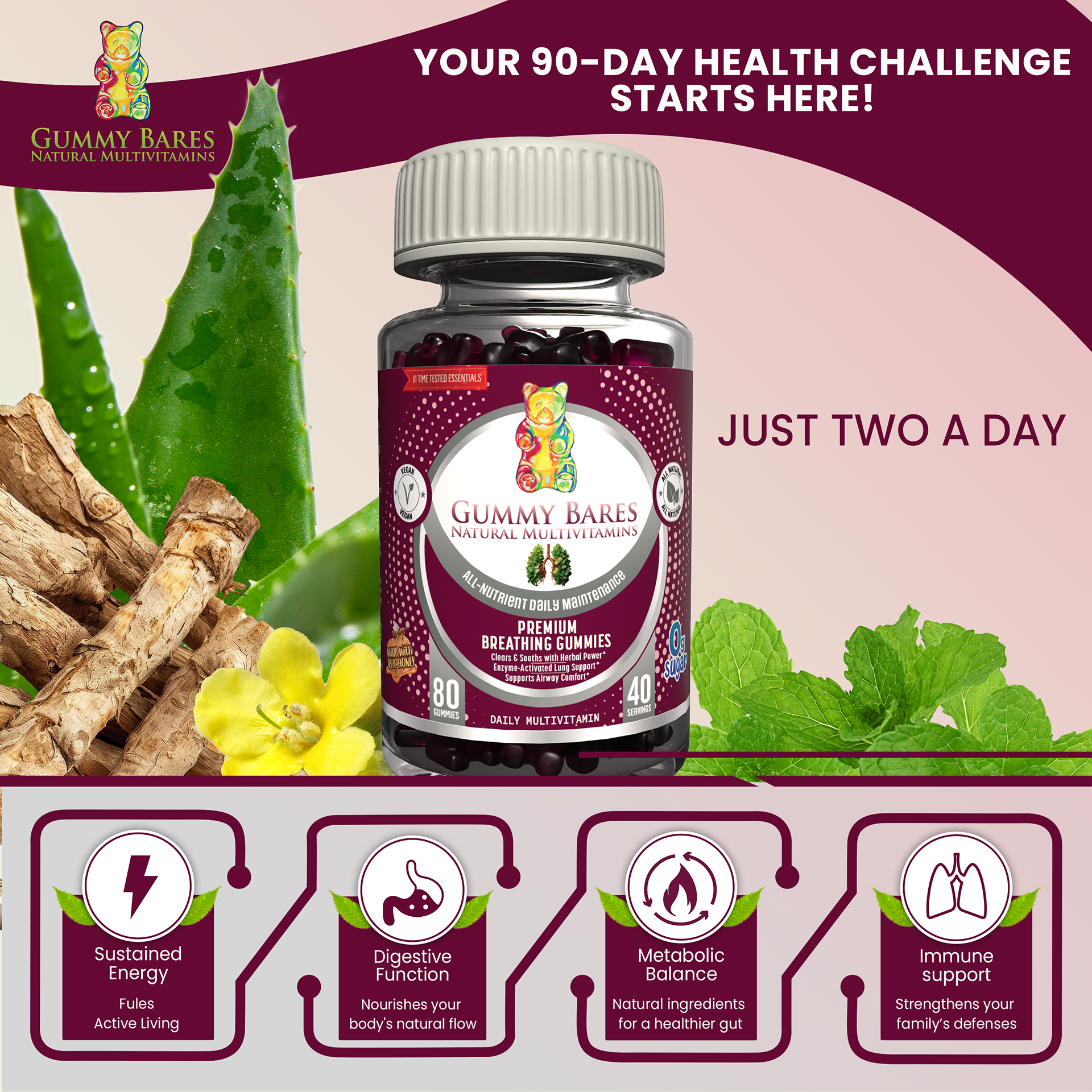
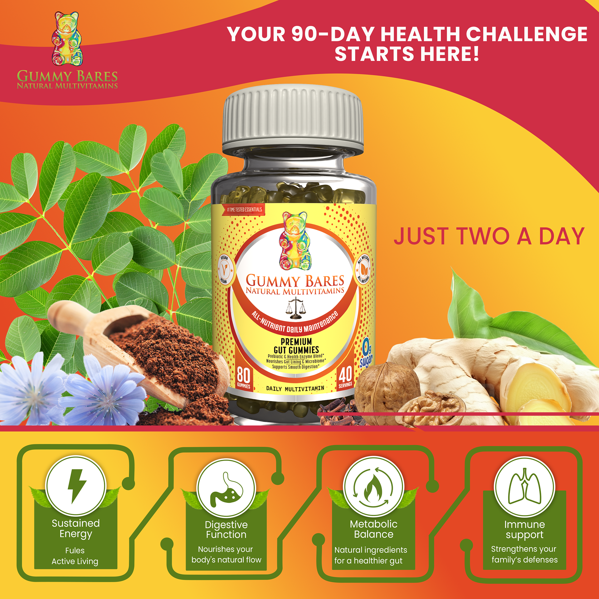
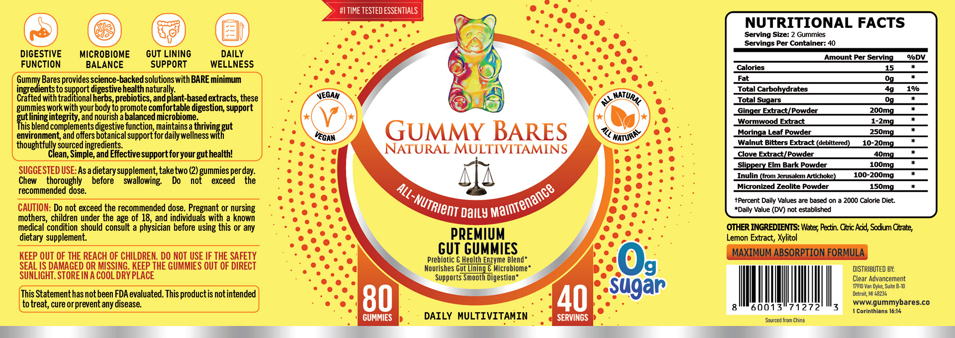
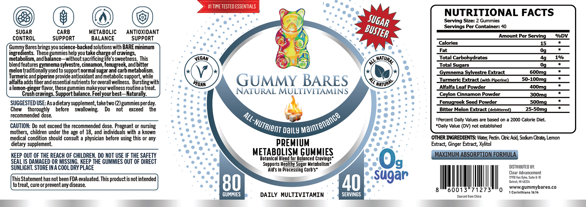
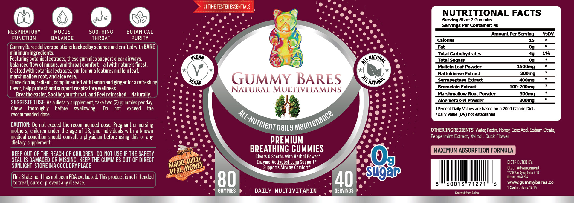
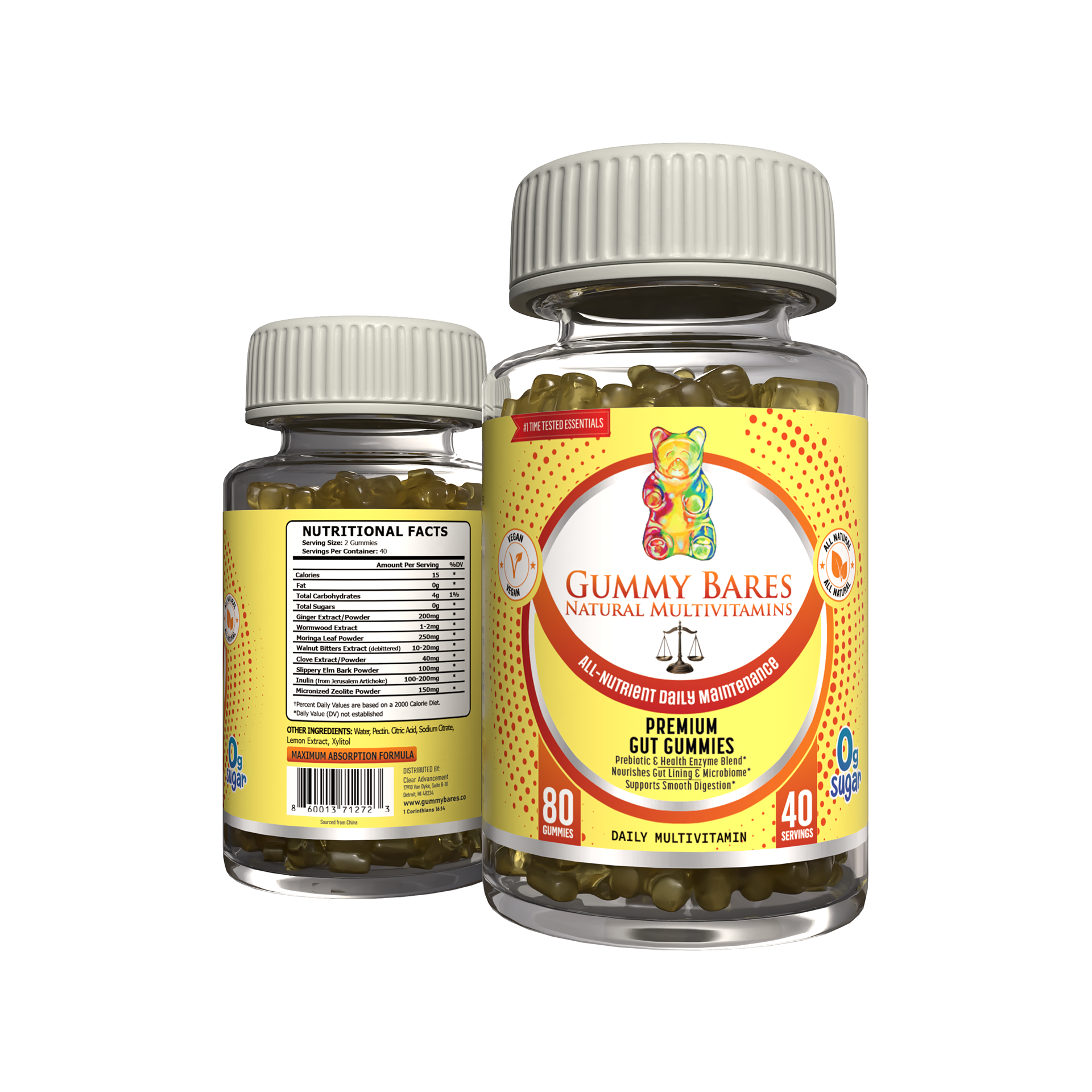
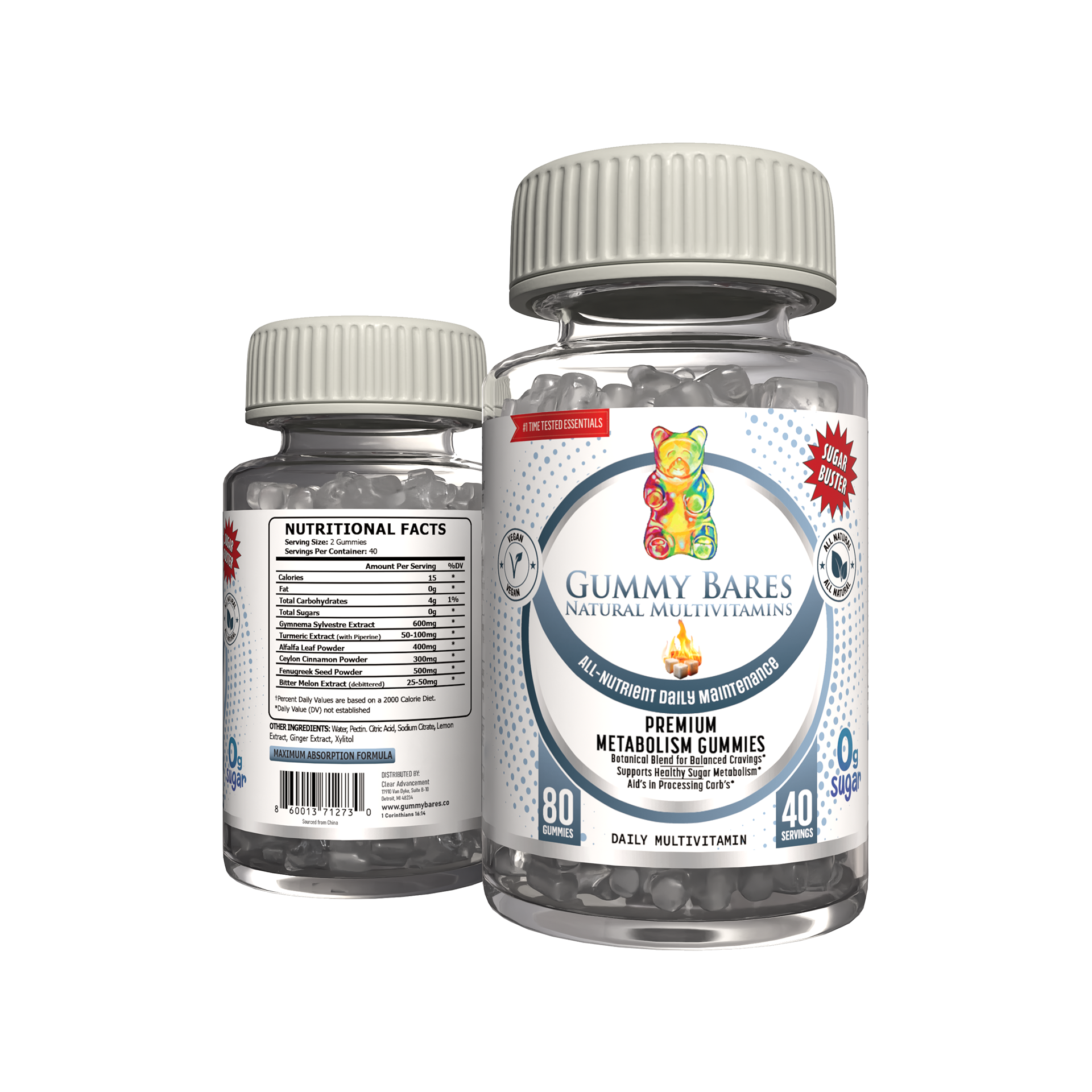
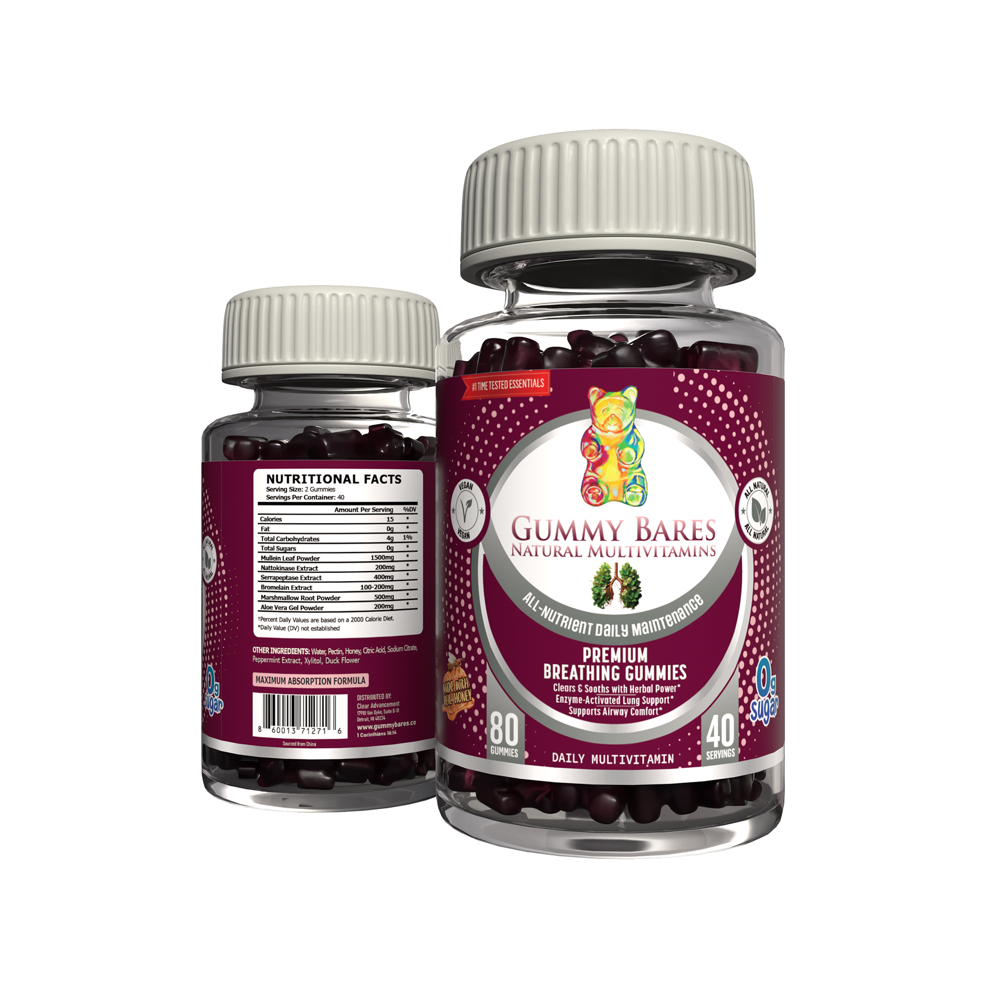
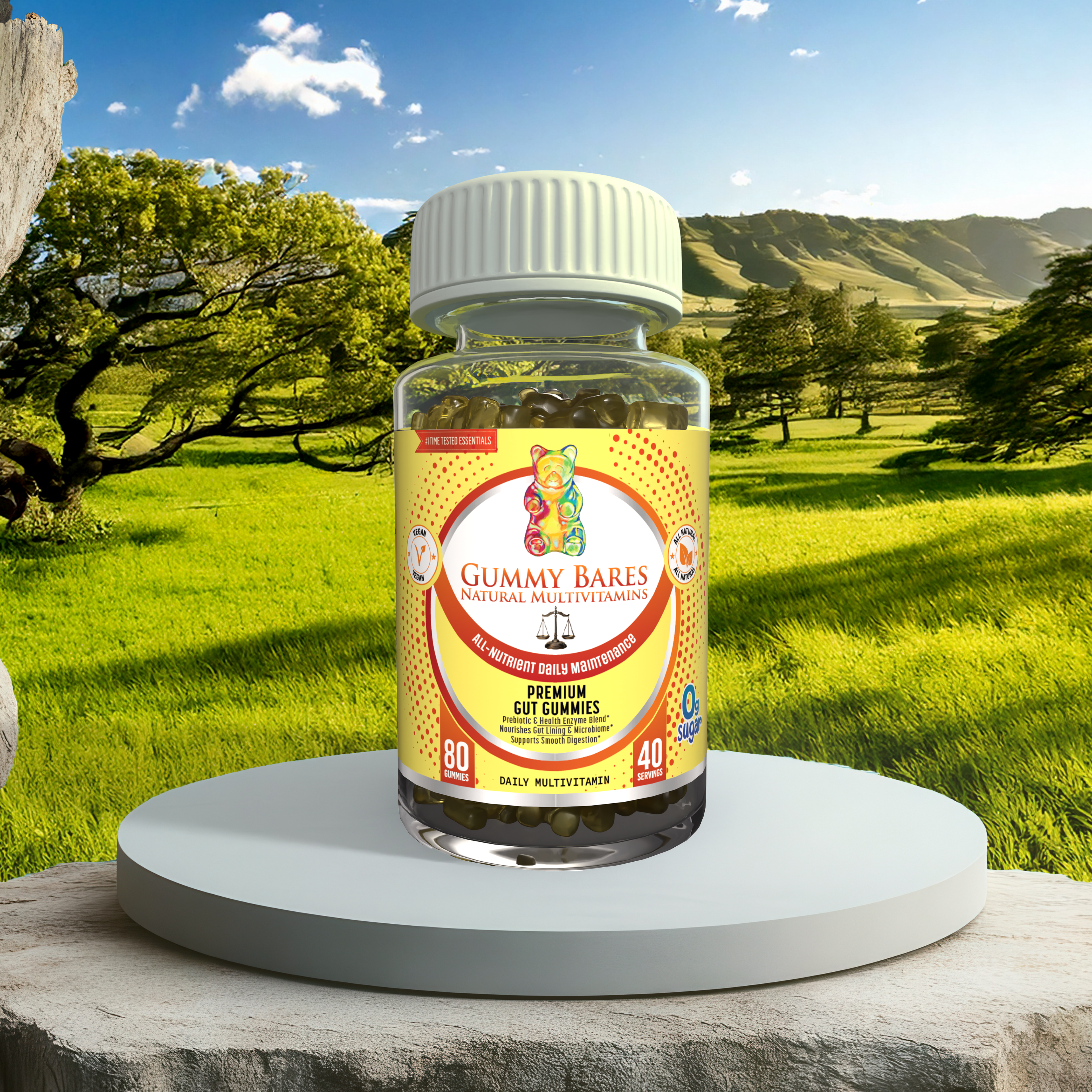
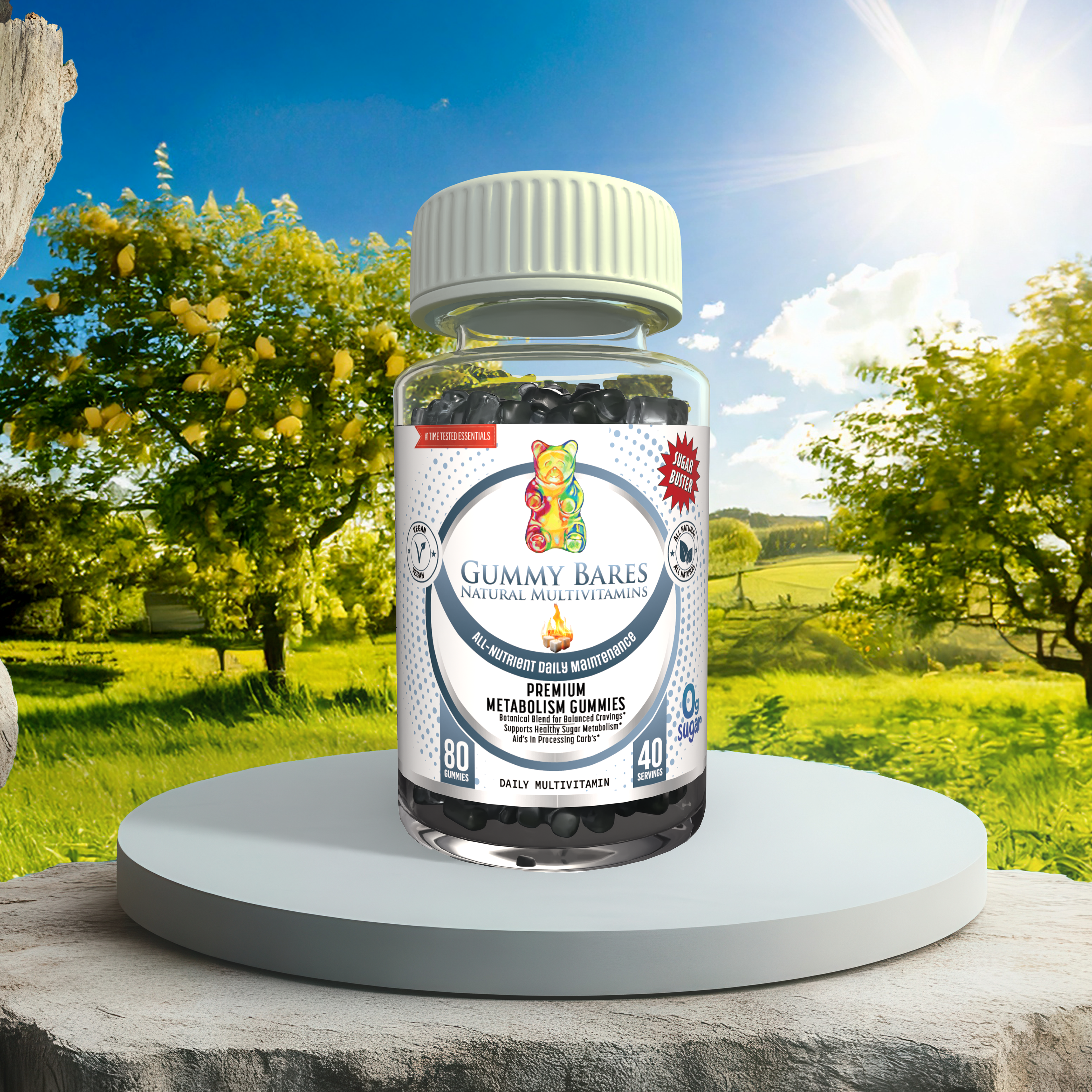
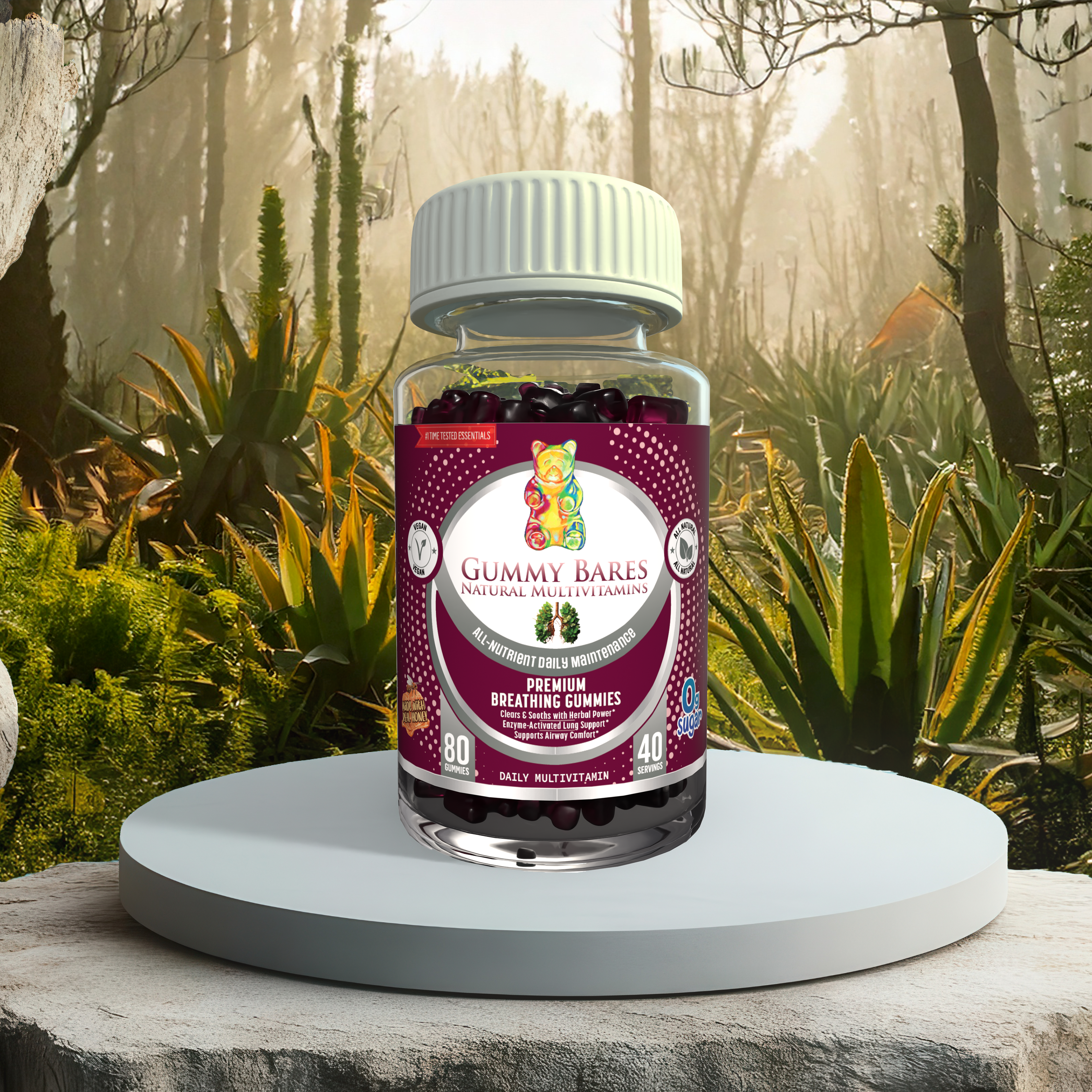
Package Design
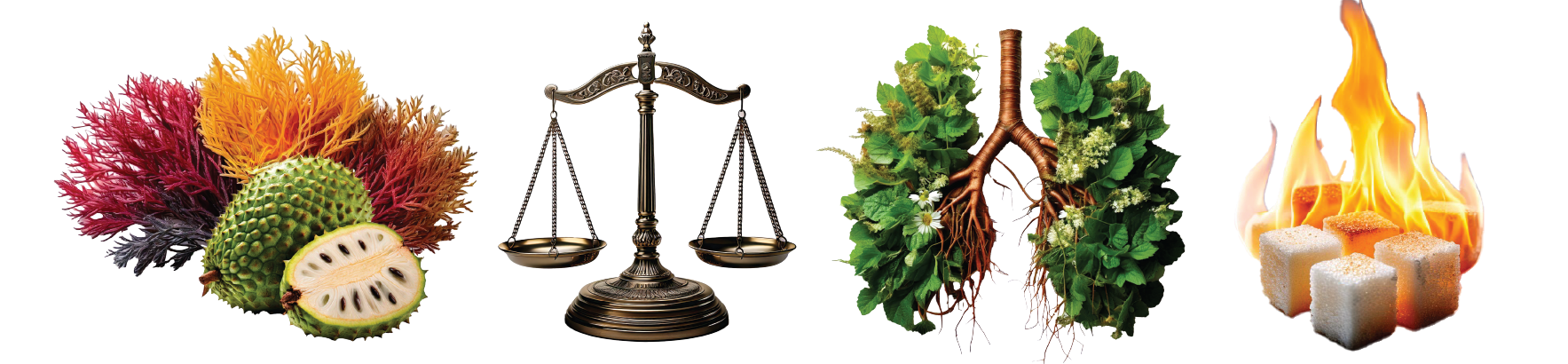
To expand the product line, I developed three unique packaging variations.
Each design follows a cohesive brand system while using distinct color palettes to help consumers immediately identify different flavor profiles on the shelf
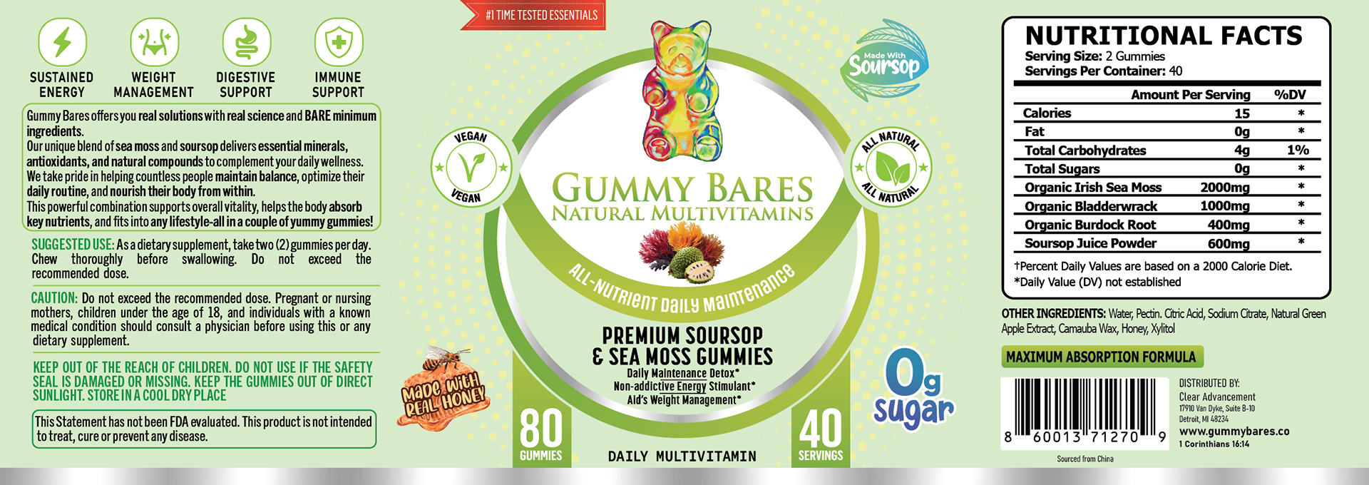
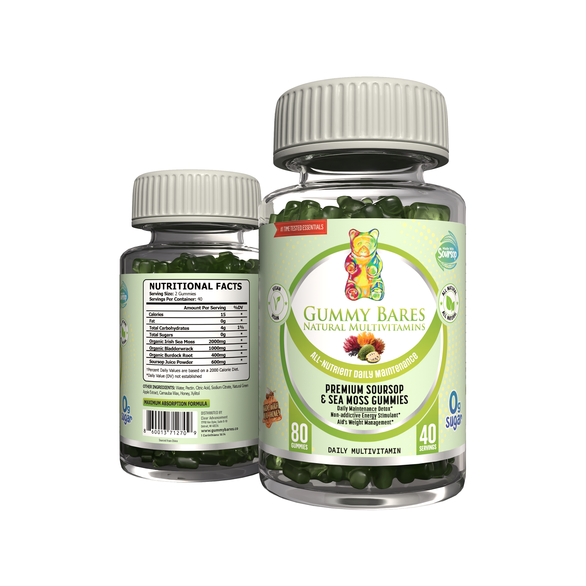

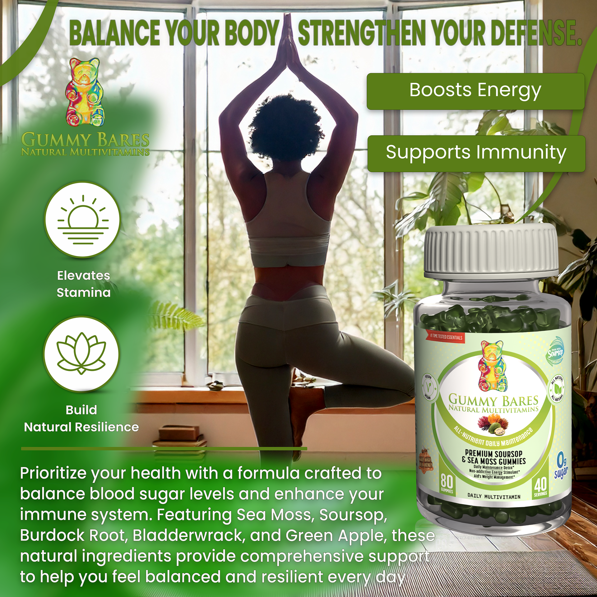
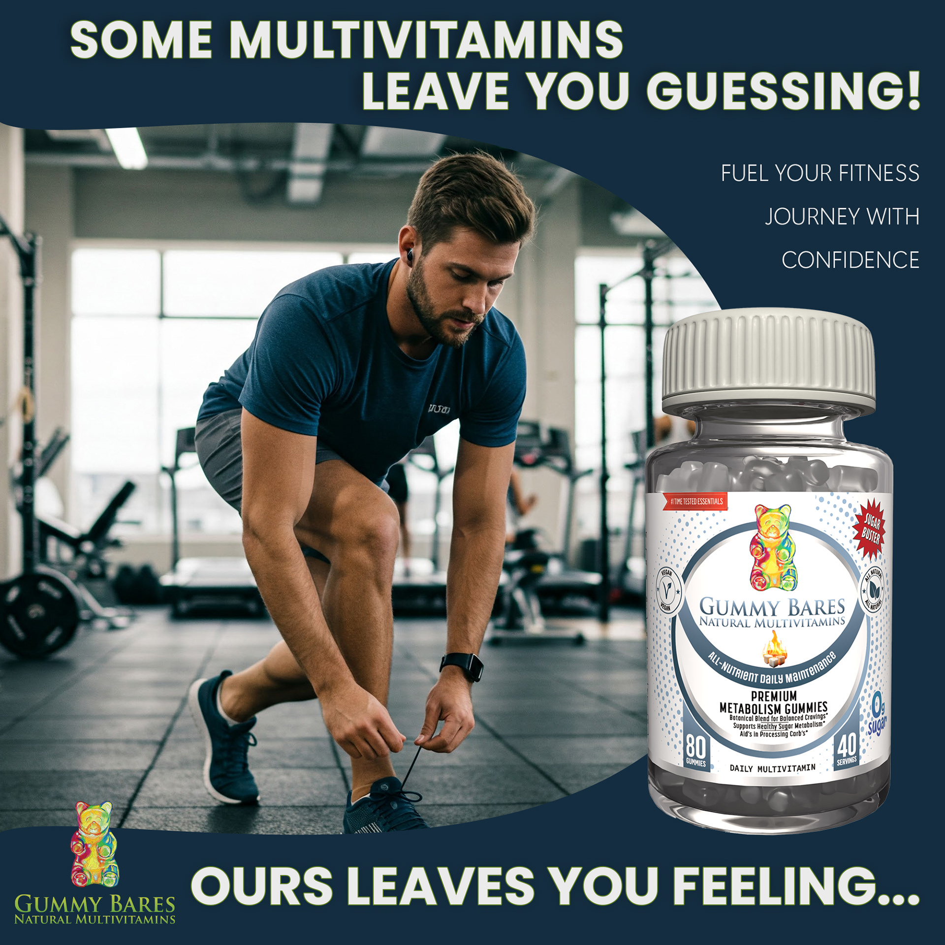
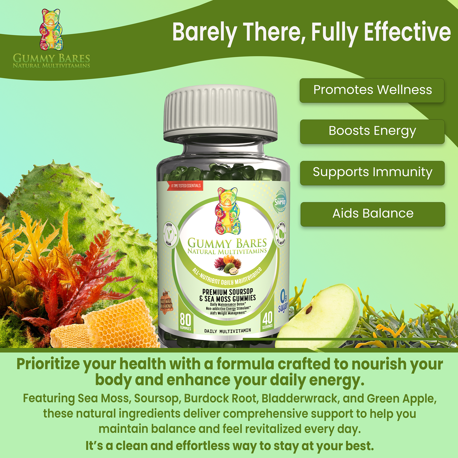
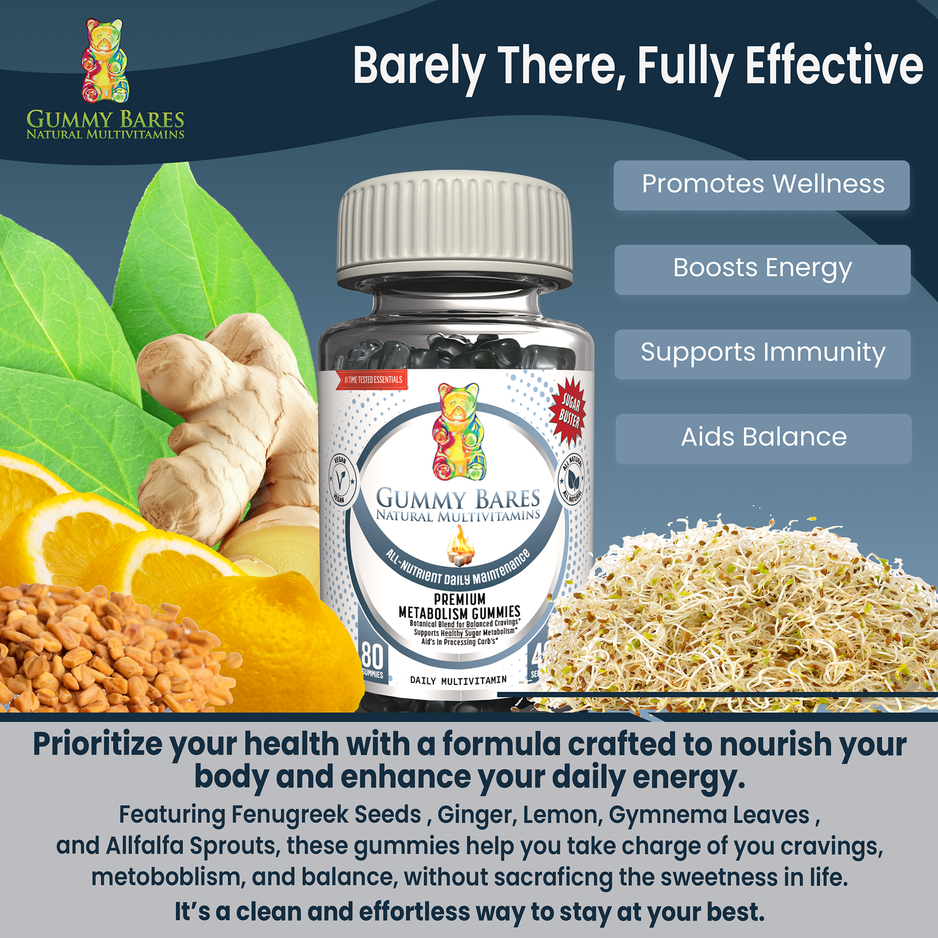
RETAIL AD's
I utilized 3D rendering to create high-fidelity product mockups
and e-commerce carousel assets.
and e-commerce carousel assets.
By visualizing the final packaging in a 3D space, I was able to provide the client with professional marketing materials before the products ever reached the production line.
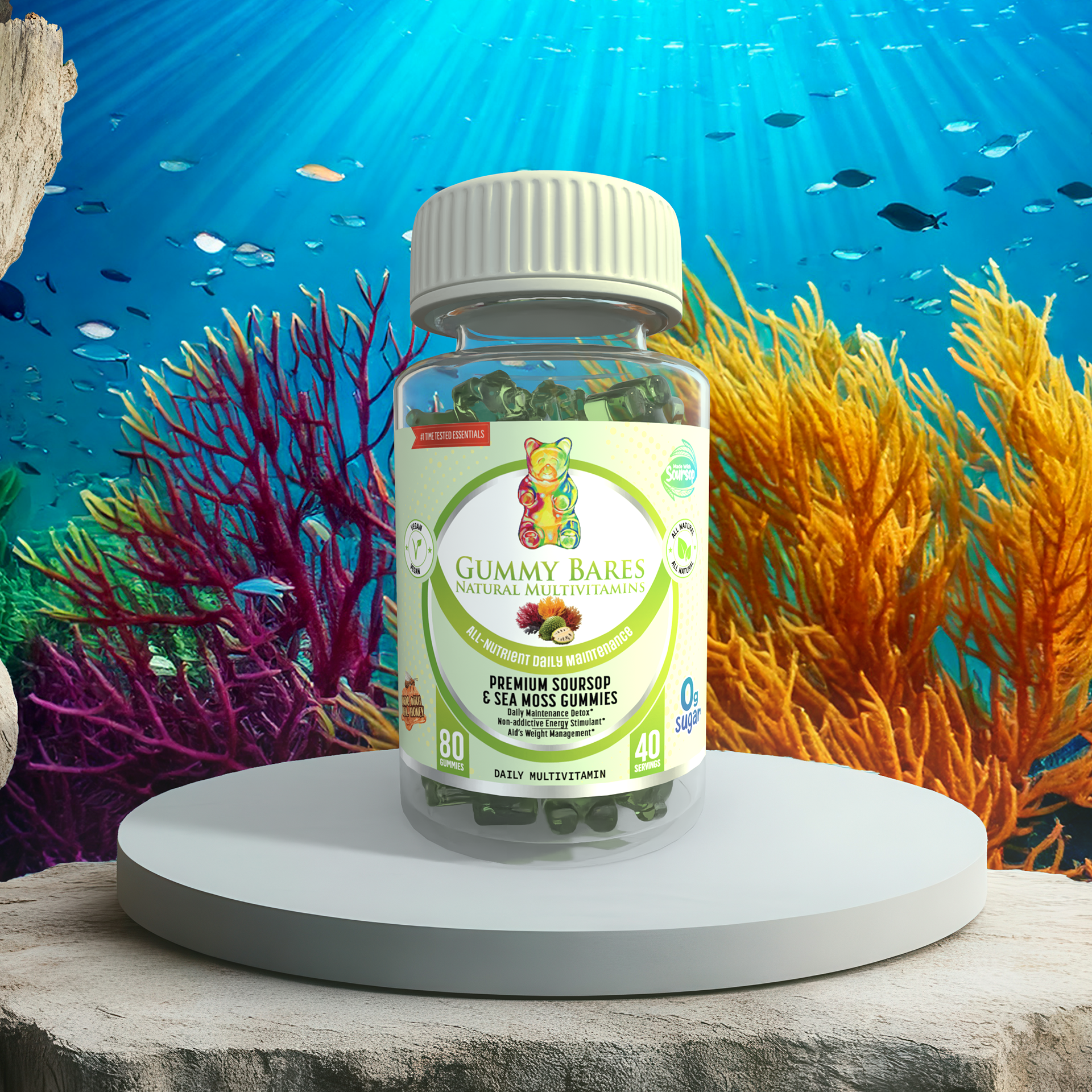
These carousel-ready graphics were created as a
proof of concept for digital retail.
proof of concept for digital retail.
These translate the playful Gummy Bares identity into a
high-conversion sales tool, using bold infographics to highlight
key selling points for the online shopper.
high-conversion sales tool, using bold infographics to highlight
key selling points for the online shopper.